
Page 55 - Packaging News Magazine Jan-Feb 2019
P. 55
January-February 2019
www.packagingnews.com.au DESIGN
PROFILE
55
rary use of classic motifs as well as an extraordinary attention to detail in the visual arrangement and the tactile choreography that make these designs distinctive.
Harcus tells me she is deeply in- volved in creative direction, typog- raphy and image, and has an in- grained, profound respect for craft and history.
“Resourcing the past is a relevant tool as it subliminally creates reso- nance... and can make connections to the present in a fresh way,” she says, noting this is very pertinent to wine where the product’s perceived value is about knowledge, heritage and experience.
One of the dominant trends that she is at pains to capture in her packaging designs is provenance.
“Consumers want to know where their products hail from; brand owners want to share the often rich history and heritage that the prod- uct’s provenance embodies,” she says. The Maine Beach Ligurian Honey pack (pictured left) is a case in point.
“The box is designed as a keep- sake, and as the gift wrapping. De- signing for reuse aligns with the shift in thinking on sustainability, and aligns with the brand values,” Harcus says.
“In luxury packaging, we’re in a period of foils and holographics,” she adds. “The ‘bling’ and pattern factor is still a prominent direc- tion.” She goes on to note that the combination of multi-levelled print- ing and finishing techniques like debossing, embossing and high
build also add texture and im- pact, especially to wine labels, packs and even wine caps.
“In the competitive wine space, a carefully crafted tactile label that expresses a fascinating story goes a long
way to capture the imagina- tion... we need to be engaging senses on multiple levels, it’s what consumers expect,” she says.
Of course, the style of label is de- termined by the price point and the brand strategy, but in Harcus’s view, labels that lean only towards novelty and ‘bang on shelf’ tend to have a shorter shelf life – the nov- elty factor needs to be carefully as- sessed so that it doesn’t diminish the expectations about the quality of the wine.
“Label graphics can be impactful and timely – ‘of the moment’ – but branding needs to be enduring and not faddish. Striking the balance between the classic and the con- temporary can create a dynamic brand that enjoys greater longevi- ty,” she says.
Packaging has been the mainstay of her business through four reces- sions, she observes. Other indus- tries wax and wane, but products always need packaging and it re- mains the core vehicle for engaging the consumer. ■
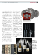
CLOCKWISE FROM ABOVE: Spicers Paper: Spicers Wine & Gourmet Companion – Qudos XO Cognac, 2016.
Yalumba: y/our yalumba, 2012.
Plantagenet Wines: Three Lions, 2016.
Hill-Smith Family Vineyards: Jansz Vintage Collection and gift boxes, 2013.
SLINGSHOT
STEPHEN CLARKE
GAVIN JONES
STEPHEN CLARKE
