
Page 15 - Packaging News July - August 2019
P. 15
15
July-August 2019 www.packagingnews.com.au
DESIGN
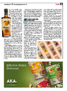
heroes the friendly ‘shaka’ hand gesture to encapsulate
Byron Bay’s laid back vibe. “As you drive into Byron Bay there is a sign that says ‘cheer up, slow down, chill out’, and we wanted to create a brand that beautifully captured this effortless- ly smooth vibe,” says Co-Partnership co-
founder Max Harkness. “The ‘shaka’ sign that you see on the front label is a friendly ges- ture known in the surf community to say ‘wel- come’. We love how this universal hello holds the
macadamia branch.” Harkness says the colour palette was di- rectly influenced by the liqueur’s flavour profile – roasted macadamias, butterscotch, cacao and wattleseed, “AKA bush coffee” – and is complemented with gold foiling, which can “catch the eye from a dimly lit bar”, as well as offering a
premium cue.
As the distillery sits in the heart of the
rainforest of the Northern Rivers region in New South Wales, Harkness says the cap- sule’s leafy design references the area, as well as the Brook family’s passion for the rainforest’s regeneration, with many of the liqueur’s ingredients sourced from there.
Co-Partnership’s design also features a playful tone in its messaging, using phras- es such as, “Mix up a little somethin’ somethin’” and “A smooth local from By- ron Bay”.
“It was great to bring out the personality of the brand through the copywriting to make a connection with the consumer and build a smile in the mind,” says Harkness.
Mac by Brookie’s is available in indepen- 4dent Australian drinks retailers, as well as
at the Cape Byron Distillery and online.
ARNOTT’S KEEPS IT SIMPLE WITH BACK-TO-BASICS DESIGN
Australia’s much-loved biscuit brand Ar- nott’s has added a new range to its growing snack portfolio, with The Edison Agency engaged to help develop a ‘back to basics” sub-brand that showcases the simple joys of baking using only ingredients you would recognise from your pantry.
With great tasting home-style biscuits and an appetite to innovate, this simple new range needed a confident voice, according to Amber Bonney, director at The Edison Agency.
“Our task was to bring this exciting new product to life through research, brand design, asset creation and packaging.”
To come up with the brand’s unique ex- pression, Edison analysed premiumisation cues, the
world of ‘better-for-you’
snacks, and whole foods to help uncover key cross-cate- gory insights.
The design solution uses a bespoke packaging format developed by Arnott’s – an innovative vertical tray allowing the range to have strong shelf cut-through in what is a cluttered and competitive environment.
The visual tension created between the look of brown
paper and the vibrancy of the nostalgic colour palette supports the brand idea of “home style biscuits baked by the ex- perts,” allowing the beautiful simplicity of the biscuit to be the hero.
Edison’s design idea mirrored the authenticity of the product itself with an honest list of core pantry-style ingredi- ents and ‘real’ product photography – no embellishments.
The Simple Batch biscuits contain only familiar, recognisable household ingre- dients such as flour, oats and eggs, and sweetened with raw sugar, honey, or golden syrup.
“We are incredibly excited to launch Arnott’s Simple Batch and deliver a new offering to biscuit lovers,” says Arnott’s marketing director for snack innovation Sarah Ryan. “We know people enjoy the taste and texture of home baking but often don’t have the time or interest to pop on the oven mitts, which is where Simple Batch comes in. Delivering simple ingredi- ents and delicious biscuits – it’s a win, win,” Ryan says. ■
