
Page 74 - Print 21 July-August 2019
P. 74
Wide Format
Paul Lindstrom
Colour control
for printed interiors
Professor Paul Lindstrom tells us how to apply colour management successfully to operate in the booming world of wide format printed interiors.
Interior design and décor are perfect candidates for large format digital printing, since the technology enables short print runs, down to single items, as well
as short turnaround from conception to proof and final prints. But as with any type of print production, applied colour management is key for a successful project.
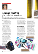
One of the challenges when entering into the arena of interior design is the wide range of substrates you may encounter. The same ink applied to a glass surface will not look the same when applied to fabric, or for that matter different types of paper. A classic way to assess how a certain ink, or named colour such as spot colours will appear, is to ask for a print sample.
When we talk about paper, one well known manufacturer of spot colour inks is Pantone, and you are probably familiar with their colour guides.
But did you know that Pantone also produces colour guides for fashion, that is, print samples made on fabric and plastic? So one of the first steps to control colours in an interior design project is to get hold of prints samples or colour guides relevant for the substrate at hand.
Since some of those colour guides are quite expensive, you might ask the printer you plan to use to let
you come over and have a look in the colour books.
Later on in the process you should be able to have samples, proofs, printed on the actual device which will be used in the final production, on the actual substrate you have chosen. This is one of the obvious benefits of working in a truly digital workflow: the possibility to print a single copy economically.
Advanced options
Full colour control in a print project means colour accurate previews of the design early on in the process. But in order to be able to trust what you see on the computer screen, you need to make sure the monitor is good enough. Good enough for colour accurate proofing demands a high- quality monitor and the ability to calibrate it properly. Unfortunately there is no way around this: standard (read cheap) monitors are not up to this task. They might have a large enough colour gamut technically, but unless you can calibrate the monitor
using a colorimeter or spectrophotometer,
you have no control over how it displays the colours or knowing if they really are colour accurate.
Another difference between high end monitors for colour proofing and standard monitors is the degree to which they are sensitive to view angles. On most standard monitors the colours differ a lot even with a slight change of viewing angle, and this is not good enough for colour accurate softproofing.
The monitor needs to have the higher quality panels using IPS technology (In Plane Switching), which means they show colours in
the same way regardless of what view angle is used. Watch out for this in the technical specification and make sure the monitor you plan to try out or buy uses IPS technology. Also make sure the monitor comes with a hood, to block out surrounding light, another factor which will affect how colours appear on screen. If the monitor
74 Print21 JULY/AUGUST 2019
