Page 38 - Print 21 Magazine Nov-Dec 2018
P. 38
Wide Format
You need to preflight your artwork so you have factored in things like bleed, so you don’t have gaps in the design when you cut or stitch the garment together.
colours, or if the colours are converted to the colour space (ink setup) of the printing device. If spot colours will be converted, you need to check that the colours match your expectation so ask for colour accurate proofs before the final print production.
Many professional designers of artwork for high end graphic arts production use dedicated software for preflight checks. Among the most well known are Callas PDF Toolbox, Enfocus PitStop, and Markzware FlightCheck. If you use Adobe CC you
have some basic preflight functions in InDesign, and a light version of the Callas PDF Toolbox is embedded in Adobe Acrobat Pro. If you have not tried this before, it should be worthwhile, as there are many fixups available in the preflight functions
in Acrobat Pro.
Some of the final adjustments and optimisations of your artwork are made
in the professional software used in
the prepress department. Examples are workflow and Raster Image Processing systems (rip) from vendors like EFI, with their Fiery rip series used by many vendors, among them HP – it is the graphics industry preferred rip across all industry sectors, and there are special versions for digital print
on fabrics developed by Ergosoft for Roland DG. But while those rip systems can do a lot to enhance your artwork, they might not be able to fix serious errors or shortcomings. So learn which key preflight steps you need to pay attention to, and prepare your artwork carefully; in this way you will achieve the top quality end result you hoped for. 21
The Wild Format guides are intended to expand awareness and understanding of the craziness that can be created on wide format digital printing devices, from floors to lampshades
and everything in between.
These guides are made possible by a group
of manufacturers working together with Digital Dots.
This particualr article is supported by EFI (www.efi.com),Fujifilm (www.fujifilm.com), HP (www.hp.com), Roland DG (www.rolanddg. eu) and Digital Dots (www.digitaldots.org).
Together we hope you enjoy the articles
and that you put into practice what you
learn. If you want to talk about it, go to our LinkedIn group at https://www.linkedin.com/ groups?home=&gid=8178178.
entirely smooth, so you might get away with fairly low resolution in the images – but keep an eye on this anyhow. It is better to get it right before you send the work off to be printed.
Bleed refers to print that has to go completely to the edge of the substrate.
It’s the term for when a printed area is supposed to be cut off, but you want the image to go over the trimmed edge. Make sure you have some 3-5mm bleed on any such image, so you don’t have a gap when the fabric is cut or stitched together either with other parts of a garment or for interior décor, such as cushions which need to have a seamless appearance.
for trapping needs to be done in your artwork. Sometimes this is better dealt with in the workflow system used in the prepress department, and if so they will tell you what they plan to do. Either way, ask the question.
How to prep artwork
Most print service providers with experience of digital colour printing on textiles will offer guidance on how the artwork should be prepared for a certain type of production and project. Use those guides when available, and take the time to read them through and ask questions if you aren’t sure.
“If anyone has given you the impression that there are no special technical requirements for digital printing in terms of how the artwork is prepared, they are unfortunately mistaken, or they underestimate the challenges.”
Do not assume that it will
all be fine. We would strongly recommend that you favour print service providers who have taken the time and effort to produce
such guides because it shows their commitment to you as a customer, and an ambition to help you achieve the highest possible quality in your printed products.
Trapping is the term for when different colours touch in a design, and depending on the characteristics of the ink, you might have a possibly unwelcome change in colour appearance in the area where they overlap. If you for example have an area with pure yellow and another area of cyan (blue) side- by-side, you will get green of the overlap due to some slight misregistration in the printing process.
Luckily most digital printing presses are very precise in how they lay down ink, so
in most cases this shouldn’t be a problem, but if in doubt you should check with the prepress department at your contracted printer, and they can advise if compensation
38 Print21 NOVEMBER/DECEMBER 2018
You should expect some instructions on which file format they prefer for images and logos (vector graphics).
For artwork created in Adobe Illustrator,
it’s common to suggest that the text in illustrations and logos is converted to vectors. Vectorisation converts text into outlines in order to avoid problems with missing fonts in artwork.
You should also expect some instructions from the printer relating to colour management, specifically which colour profiles they prefer for RGB work, as well as their recommended ICC profiles for CMYK work. If you address colours in your artwork as defined spot colours, you need to be sure if the printer can really handle true spot
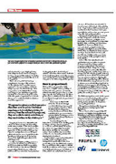
IMAGE: ROLAND DG


