
Page 24 - Australian Photography Dec 2020
P. 24
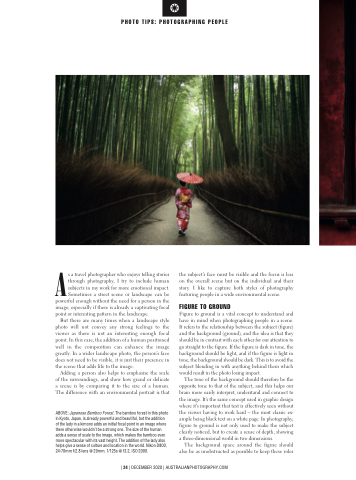
                 PHOTO TIPS: PHOTOGRAPHING PEOPLE
 As a travel photographer who enjoys telling stories through photography, I try to include human subjects in my work for more emotional impact. Sometimes a street scene or landscape can be powerful enough without the need for a person in the image, especially if there is already a captivating focal point or interesting pattern in the landscape.
But there are many times when a landscape style photo will not convey any strong feelings to the viewer as there is not an interesting enough focal point. In this case, the addition of a human positioned well in the composition can enhance the image greatly. In a wider landscape photo, the person’s face does not need to be visible, it is just their presence in the scene that adds life to the image.
Adding a person also helps to emphasise the scale of the surroundings, and show how grand or delicate a scene is by comparing it to the size of a human. The difference with an environmental portrait is that
ABOVE: Japanese Bamboo Forest. The bamboo forest in this photo in Kyoto, Japan, is already powerful and beautiful, but the addition of the lady in a kimono adds an initial focal point in an image where there otherwise wouldn’t be a strong one. The size of the human adds a sense of scale to the image, which makes the bamboo even more spectacular with its vast height. The addition of the lady also helps give a sense of culture and location in the world. Nikon D800, 24-70mm f/2.8 lens @ 29mm. 1/125s @ f3.2, ISO 2000.
the subject’s face must be visible and the focus is less on the overall scene but on the individual and their story. I like to capture both styles of photography featuring people in a wide environmental scene.
FIGURE TO GROUND
Figure to ground is a vital concept to understand and have in mind when photographing people in a scene. It refers to the relationship between the subject (figure) and the background (ground), and the idea is that they should be in contrast with each other for our attention to go straight to the figure. If the figure is dark in tone, the background should be light, and if the figure is light in tone, the background should be dark. This is to avoid the subject blending in with anything behind them which would result in the photo losing impact.
The tone of the background should therefore be the opposite tone to that of the subject, and this helps our brain more easily interpret, understand and connect to the image. It’s the same concept used in graphic design where it’s important that text is effectively seen without the viewer having to work hard – the most classic ex- ample being black text on a white page. In photography, figure to ground is not only used to make the subject clearly noticed, but to create a sense of depth, showing a three-dimensional world in two dimensions.
The background space around the figure should also be as unobstructed as possible to keep these roles
| 24 | DECEMBER 2020 | AUSTRALIANPHOTOGRAPHY.COM
