
Page 19 - Packaging News Jan-Feb 2020
P. 19
19
January-February 2020 www.packagingnews.com.au
DESIGN
memorable and meaningful and we deliv- er that narrative through the use of metaphor and symbolism,” he says.
SPC category marketing manager Natalie Cukierman says the story of Sir Henry had been lost over the years and the brand had stopped resonating with the modern Aus- tralian consumer, which the brand was looking to change with the redesign.
“We needed to reinvent [the brand], clar- ify its position in the market and elevate its meaning above the generic product feature and benefit stories being told across the category,” says Cukierman.
“Our challenge was to articulate the values of the past in such a way that they resonate with everyday Austra- lians. We feel that BrandOpus have de- livered this delightfully.”
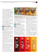
The new pack design for IXL jam extends across its range of flavours, which includes 3Strawberry, Raspberry, Breakfast Marma-
lade, Forest Fruits, and Apricot.
CRACKING INTO THE SNACK AISLE
Sydney-based studio Tweak has teamed up with The Natural Cracker Co for its launch into the cracker category, delivering a vibrant visual design that showcases a bal- ance of tasty ingredients, natural cues, and product information.
Following the successful work on The Natural Chip Co potato chip range, Tweak’s work on The Natural Cracker Co integrated the brand’s equities of ‘natural’ and ‘taste’ to help achieve cut-through shelf presence with a strong appetite appeal.
Tweak senior designer Shane King says all design elements were carefully com- posed, with the woodgrain board provid- ing an anchor for the surrounding colours and ingredient imagery.
“The board provides a consistent brand architectural element, with clear space to hold flavour and product information. From a shelf perspective, this element links the range together and visually con- trasts against the bright variant colours,” says King.
“Woodgrain textures on the board and within the variant colours provide an over- arching natural impression when the range is viewed on shelf. This breathes life and purpose into all colour tones used on pack, ensuring there is no synthetic or flat colour used anywhere in the design.”
King said the colour palette takes its cues from the established category lan- guage of bright, variant standouts – “pops of green from wheat, gum leaves, signify freshness and connect to nature”
– elements which are used across all product variants in the range.
Flora and fauna also feature on the front of the pack to connect the design to the brand’s ‘natural’ attributes, and further aims to add to the brand story.
The Natural Cracker Co range is now available in four flavours – Honey Soy 4Chicken, Sea Salt and Vinegar, Sour Cream
and Chives, and Farmhouse Cheddar.
MAKING ON-PACK MAGIC
The “magical” world of fermentation has been illustrated by Sydney studio Percept on Bear Brewing’s latest sauce range, The Ferm, maximising the use of only a clear bottle and screen printing on pack.
Bear Brewing produces fermented sauces in a variety of flavours for the Australian market, and approached the Percept team to help shift from its original brand posi- tioning, to one that developed the name and branding as “creative and clever”.
Each product in The Ferm range has a be- spoke illustration on the process and use of ingredients in a fun and characterful manner.
Percept designer Kåre Martens says the team was constrained by the existing
packaging (the clear bottle) and the print- ing technique (screen printing), which lent the concept of the design to be better suited with an illustrative approach.
“But the way we look at it, having a con- straint like that is also an opportunity to communicate clearer and be more single minded. The end result is visually stronger because of it,” says Martens.
“The bottles are clear, and the colour you see is actually the real colour of the sauces. “These are fermented sauces, absolutely no additives and sugars are used, so these are the true colours of the vegetables used. We were surprised how vibrant they were.” Martens says the idea behind the brand name and the topic of the illustrations rep- resents, “in almost an elaborated way, the most magical process behind fermenting
sauces like this”.
“There are many steps in the process and
lots of stages that are more like experimen- tation than normal cooking,” says Martens. Percept’s work on The Ferm landed the studio a finalist spot in the packaging cat-
egory for the 2019 AGDA Awards. ■
