
Page 11 - Priorities #12 2000-April
P. 11
Student View By Dan Riveong
Class of 2000
Editor’s Note: Most of us view lots of on-line text and graphics. Some some we ignore, some we endure no matter how frustrating they are what’sthere(ifwecanonlyreachit). Webdesignershavealotto reaction. We asked Dan Riveong, Class of 2000, who has been corporate web sites on a contract basis for more than a year, to explain how he does what he does.
What makes a web site great? Here are some
ideas... As many animations as possible. Three- page paper on the company philosophy. Lots of pop-up windows. Music to accompany each web page. Bright flashing text...in bold red of course.
Hopefully, you realize I am joking here. The scary thing is that all of the above have been requested by a few of my clients, whose embarrassment in this article is saved by their NDAs (Non- Disclosure Agreements, which means I can’t talk about them).
And since clients sign my paychecks, I have given in to many of their “insightful” suggestions.
web sites grab our interest, — because we need
dowithour designing
A great web site follows these three sacred virtues: it
must be useful, it must be user-friendly, it must be elegant.
What are the cardinal sins? Useless big graphics. Confusing navigation. Zero
information. This is not to say that the utilitarian design found in Yahoo! is the ideal. Its usefulness and simplicity is negated by its deafening dullness.
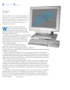
Other then the guidelines mentioned above, the process of designing a web site is an individualist’s path. Let’s take the re-design of the Zamba web site as a case study. The original web site was a second generation web site (simple blocks of text and messy, big graphics). It has eighty pages of basic corporate content: job openings, mission statement, SEC filings, et cetera. On a happy note, the stock of the company jumped on the initial launch of this site. But time passes and effectiveness wanes. Fast.
The conception of any web site begins with the question, “Why do we want people to come to the web site and what do we want them to experience?” In Zamba’s case, they wanted a site for potential employees and shareholders. The site needed a beefed-up and in-depth career and Investor Relations section. They mainly wanted the site focused as a business-to-business marketing tool. Lastly, they wanted the web site to embody the active and dynamic character of its namesake (Zamba is an Argentinean dance, but Zamba Corp. is a customer care company).
The next question is “What is the profile of people that comes to our web site?” Since the site was aimed for business-to-business use in the U.S., we no longer had worries over users with slow connections or older browsers. Thus, the cardinal sin of big, useless graphics did not apply. With no worry over bandwidth or old browsers, we were free to embellish the site with “eye candy:” streaming videos of the CEO, a Zamba dance video and fat graphics.
11
Continued Page 18
Site Under Deconstruction
