
Page 7 - Digital Sketchbook PT4UPM - Exercise 4.2
P. 7
PT4UPM Part FOUR Anne Smith no. 517377
I selected a first colour scheme that did not look pleasing. The second colour scheme makes use of both warm and cold colours. It felt slightly off somehow. I explored potential adjustment in Procreate (Digital) to create a triadic colour scheme (yellow-green, blue-purple and magenta red).
Tondo 2
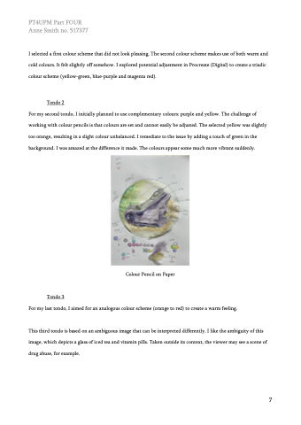
For my second tondo, I initially planned to use complementary colours: purple and yellow. The challenge of working with colour pencils is that colours are set and cannot easily be adjusted. The selected yellow was slightly too orange, resulting in a slight colour unbalanced. I remediate to the issue by adding a touch of green in the background. I was amazed at the difference it made. The colours appear some much more vibrant suddenly.
Colour Pencil on Paper
Tondo 3
For my last tondo, I aimed for an analogous colour scheme (orange to red) to create a warm feeling.
This third tondo is based on an ambiguous image that can be interpreted differently. I like the ambiguity of this image, which depicts a glass of iced tea and vitamin pills. Taken outside its context, the viewer may see a scene of drug abuse, for example.
7
