Page 63 - Understanding Psychology
P. 63
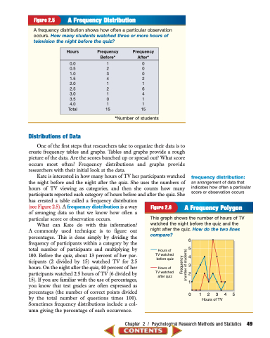
   Figure 2.5 A Frequency Distribution
 A frequency distribution shows how often a particular observation occurs. How many students watched three or more hours of television the night before the quiz?
 Hours Frequency Frequency Before* After*
 0.0 1 0 0.5 2 0 1.0 3 0 1.5 4 2 2.0 1 1 2.5 2 6 3.0 1 4 3.5 0 1 4.0 1 1 Total 15 15
*Number of students
  Distributions of Data
One of the first steps that researchers take to organize their data is to create frequency tables and graphs. Tables and graphs provide a rough picture of the data. Are the scores bunched up or spread out? What score occurs most often? Frequency distributions and graphs provide researchers with their initial look at the data.
Kate is interested in how many hours of TV her participants watched the night before and the night after the quiz. She uses the numbers of hours of TV viewing as categories, and then she counts how many participants reported each category of hours before and after the quiz. She has created a table called a frequency distribution
(see Figure 2.5). A frequency distribution is a way
of arranging data so that we know how often a
particular score or observation occurs.
What can Kate do with this information? A commonly used technique is to figure out percentages. This is done simply by dividing the frequency of participants within a category by the total number of participants and multiplying by 100. Before the quiz, about 13 percent of her par- ticipants (2 divided by 15) watched TV for 2.5 hours. On the night after the quiz, 40 percent of her participants watched 2.5 hours of TV (6 divided by 15). If you are familiar with the use of percentages, you know that test grades are often expressed as percentages (the number of correct points divided by the total number of questions times 100). Sometimes frequency distributions include a col- umn giving the percentage of each occurrence.
frequency distribution:
an arrangement of data that indicates how often a particular score or observation occurs
  Figure 2.6 A Frequency Polygon
 This graph shows the number of hours of TV watched the night before the quiz and the night after the quiz. How do the two lines compare?
 Hours of TV watched before quiz
Hours of TV watched after quiz
6 5 4 3 2 1
012345 Hours of TV
 Chapter 2 / Psychological Research Methods and Statistics 49
 Frequency (number of students)


