Page 642 - Understanding Psychology
P. 642
 Skills Handbook
Visual Literacy Skills
  Interpreting Charts, Tables, Graphs, and Diagrams
Data gathered in psychology research are often presented in charts, tables, graphs, and diagrams. These visual representations of data organize the information to make it quicker and easier to read, compare, and contrast.
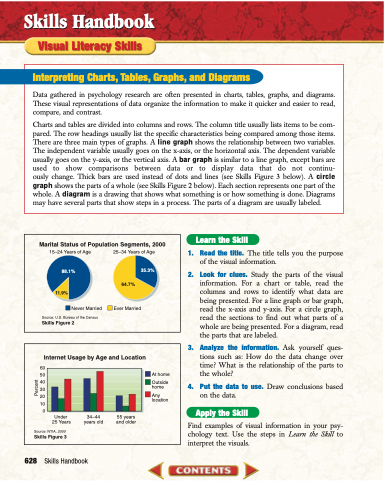
Charts and tables are divided into columns and rows. The column title usually lists items to be com- pared. The row headings usually list the specific characteristics being compared among those items. There are three main types of graphs. A line graph shows the relationship between two variables. The independent variable usually goes on the x-axis, or the horizontal axis. The dependent variable usually goes on the y-axis, or the vertical axis. A bar graph is similar to a line graph, except bars are used to show comparisons between data or to display data that do not continu- ously change. Thick bars are used instead of dots and lines (see Skills Figure 3 below). A circle graph shows the parts of a whole (see Skills Figure 2 below). Each section represents one part of the whole. A diagram is a drawing that shows what something is or how something is done. Diagrams may have several parts that show steps in a process. The parts of a diagram are usually labeled.
  Marital Status of Population Segments, 2000
15–24 Years of Age
88.1%
11.9%
Never Married
Source: U.S. Bureau of the Census
Skills Figure 2
25–34 Years of Age
35.3%
Ever Married
Learn the Skill
1. Read the title. The title tells you the purpose of the visual information.
2. Look for clues. Study the parts of the visual information. For a chart or table, read the columns and rows to identify what data are being presented. For a line graph or bar graph, read the x-axis and y-axis. For a circle graph, read the sections to find out what parts of a whole are being presented. For a diagram, read the parts that are labeled.
3. Analyze the information. Ask yourself ques- tions such as: How do the data change over time? What is the relationship of the parts to the whole?
4. Put the data to use. Draw conclusions based on the data.
Apply the Skill
Find examples of visual information in your psy- chology text. Use the steps in Learn the Skill to interpret the visuals.
      60
  50
  40
  30
  20
  10
0
Source: NTIA, 2000
Skills Figure 3
At home
Outside home
Any location
64.7%
 Internet Usage by Age and Location
      628
Skills Handbook
Under 25 Years
34–44 years old
55 years and older
    Percent


