Page 170 - Geosystems An Introduction to Physical Geography 4th Canadian Edition
P. 170
 134 part I The energy–atmosphere System
             80° 160° 140° 120° 100° 80° 60° 40° 20° 0° 20° 40° 60° 80° 100° 120° 140° 160° 80°
                          60°
60°
            40°
20°
0°
20°
ncer
40°
20°
0°
20°
  Tropic of Ca
                         Equator
                         Tropic of Capricorn
     40°
   01 R
 3000 KILOMETRES OBINSON PROJECTION
500
   60°
Antarctic Circle
60°
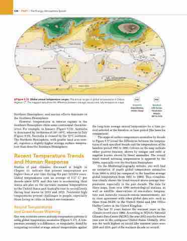
       ▲Figure 5.16 Global annual temperature ranges. The annual ranges of global temperatures in Celsius degrees, C°. The mapped data show the difference between average January and July temperature maps.
Animation
Global Warming, Climate Change
Notebook
GISS Surface Temperature Analysis, 1891 to 2006
Northern Hemisphere, and marine effects dominate in the Southern Hemisphere.
However, temperatures in interior regions in the Southern Hemisphere show some continental character- istics. For example, in January (Figure 5.12), Australia is dominated by isotherms of 20°–30°C, whereas in July (Figure 5.13), Australia is crossed by the 12°C isotherm. The Northern Hemisphere, with greater land area over- all, registers a slightly higher average surface tempera- ture than does the Southern Hemisphere.
Recent Temperature Trends and Human Response
Studies of past climates, discussed at length in Chapter 11, indicate that present temperatures are higher than at any time during the past 125000 years. Global temperatures rose an average of 0.17 C° per decade since 1970, and this rate is accelerating. Heat waves are also on the increase; summer temperatures in the United States and Australia rose to record levels during heat waves in 2012 and 2013. Persistent high temperatures present challenges to people, especially those living in cities in humid environments.
Record Temperatures
and Greenhouse warming
One way scientists assess and map temperature patterns is using global temperature anomalies (Figure 5.17). A tem- perature anomaly is a difference, or irregularity, found by comparing recorded average annual temperatures against
the long-term average annual temperature for a time pe- riod selected as the baseline, or base period (the basis for comparison).
The maps of surface-temperature anomalies by decade in Figure 5.17 reveal the differences between the tempera- tures of each specified decade and the temperatures of the baseline period 1951 to 1980. Colours on the map indicate either positive (warmer, shown by oranges and reds) or negative (cooler, shown by blues) anomalies. The overall trend toward warming temperatures is apparent by the 2000s, especially over the Northern Hemisphere.
On the MasteringGeography website, you will find an animation of yearly global temperature anomalies from 1884 to 2012 (as compared to the baseline average global temperature from 1951 to 1980). This visualiza- tion clearly shows the trend toward above-average tem- peratures, especially in the past decade. The data for these maps, from over 1000 meteorological stations, as well as satellite observations of sea-surface tempera- ture and Antarctic research-station measurements, are in close agreement with other global data sets, such as those from NCDC in the United States and Met Office Hadley Centre in the United Kingdom.
The last 15 years feature the warmest years in the climate record since 1880. According to NOAA’s National Climatic Data Center (NCDC), the year 2012 was the hottest year ever in the contiguous United States. Globally, 2012 was the tenth highest on record (the warmest years were 2005 and 2010, part of the warmest decade on record).
30°
20°
15°
25°
25°
10°
60°
45°
45°
55°
35°
25° 30° 20°
40°
50°
45° 40°
35°
30°
20°
15°
10°
15°
10°
5°
20°
15°
5°
3°
3°
10°
10°5°
3°
5°
3°
10°
20°
3°
10°
5°
15°
5°
10°
15°
5°
3°
5°
5°
5° 10°


