
Page 230 - Python for Everybody
P. 230
218 CHAPTER 16.
VISUALIZING DATA
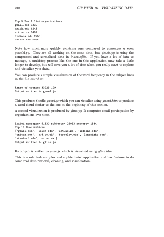
Top 5 Email list organizations gmail.com 7339
umich.edu 6243
uct.ac.za 2451
indiana.edu 2258 unicon.net 2055
Note how much more quickly gbasic.py runs compared to gmane.py or even gmodel.py. They are all working on the same data, but gbasic.py is using the compressed and normalized data in index.sqlite. If you have a lot of data to manage, a multistep process like the one in this application may take a little longer to develop, but will save you a lot of time when you really start to explore and visualize your data.
You can produce a simple visualization of the word frequency in the subject lines in the file gword.py:
Range of counts: 33229 129 Output written to gword.js
This produces the file gword.js which you can visualize using gword.htm to produce a word cloud similar to the one at the beginning of this section.
A second visualization is produced by gline.py. It computes email participation by organizations over time.
Loaded messages= 51330 subjects= 25033 senders= 1584
Top 10 Oranizations
['gmail.com', 'umich.edu', 'uct.ac.za', 'indiana.edu', 'unicon.net', 'tfd.co.uk', 'berkeley.edu', 'longsight.com', 'stanford.edu', 'ox.ac.uk']
Output written to gline.js
Its output is written to gline.js which is visualized using gline.htm.
This is a relatively complex and sophisticated application and has features to do some real data retrieval, cleaning, and visualization.
