Page 747 - Introduction to Programming with Java: A Problem Solving Approach
P. 747
                17.8 Embedded Layout Managers 713 What type of layout scheme should you use? Coming up with a good layout scheme often requires cre-
ativity. We’ll walk you through the creative process for this math-calculator example.
Trying Out the Different Layout Managers
The math-calculator window appears to have two rows and four columns. So is a two-row by four-column Gridlayout scheme appropriate? The GridLayout manager is usually adequate for positioning com- ponents in an organized tabular fashion, but it’s limited by one factor—each of its cells must be the same size. If we use a two-row by four-column GridLayout scheme for the math-calculator window, then we’ll have eight same-sized cells. That’s fine for most of the cells, but not for the top-left cell. The top left cell would hold the x: label. With such a small label, we would want a relatively small cell for it. But with a GridLayout scheme, a “relatively small cell” is not an option.
Since the GridLayout manager is less than ideal, you might want to think about the FlowLayout manager. That could sort of work if you use right-aligned components. But then you’d be at the mercy of the user to not resize the window. If the user widens the window, then the log10 x button would flow up to the top line, and you don’t want that. So the FlowLayout manager is also less than ideal. The BorderLay- out manager isn’t even close. So what’s the solution?
Using an Embedded Layout Scheme
 In coming up with layouts for more complex windows, the key is often to embed layout managers
inside other layout managers. Let’s first tackle the outer layout manager. For the math-calculator
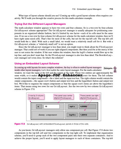
window, we want the input at the left and the output at the right. Those two entities are approximately the same width, so it makes sAenpseatogcoonsidePr uDsinFg a tEwon-cohluamnGcriedLrayout for them. The left column would contain the input components—the x label and the input text box. The right column would contain the output components—the square root’s button and output text box and the logarithm’s button and output text box. We’d like to organize the output components so that the square root’s items are above the logarithm’s items. That means using two rows for our GridLayout. See the two-row by two-column GridLayout scheme in Figure 17.8.
 Delegate.
         2-row by 2-column
GridLayout
This panel uses center- aligned FlowLayout.
These panels use right- aligned FlowLayout.
        x: 16
   sqrt x 4.00000
 dummy component
   log10 x 1.20412
 Figure 17.8
GridLayout with embedded FlowLayout panels in three of the cells
As you know, GridLayout managers only allow one component per cell. But Figure 17.8 shows two components in the top-left cell and two components in the top-right cell. To implement that organization scheme, you’ll need to group each of the two-component pairs into their own separate containers. And to achieve the proper layout, you’ll need to apply layout managers to each of those containers. The top-left


