Page 88 - IM_Algebra1_FL Print Sample.pdf
P. 88
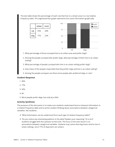
The last table shows the percentage of each row that live in a certain area in a row relative frequency table. The segmented bar graph represents the same information graphically.
urban
rural
cat
56%
44%
dog
77%
23%
Unit 3
Lesson 2: Relative Frequency Tables 21
1. What percentage of those surveyed live in an urban area and prefer dogs?
2. Among the people surveyed who prefer dogs, what percentage of them live in an urban setting?
3. What percentage of people surveyed who live in an urban setting prefer dogs?
4. How many of the people responded that they prefer dogs and live in an urban setting?
5. Among the people surveyed, are there more people who preferred dogs or cats?
Student Response
1. 40%
2. 77%
3. 60%
4. 80
5. More people prefer dogs, but only by a little.
Activity Synthesis
The purpose of this discussion is to make sure students understand how to interpret information in a relative frequency table and to prime student thinking about associations between categorical variables. Ask students,
• “What information can be understood from each type of relative frequency table?”
• “Do you notice any interesting patterns in the data? Explain your reasoning.” (It is ok if students struggle with this question at this time. The focus of the next lesson is on associations between categorical variables. Students may notice that dog lovers tend to live in urban settings, since 77% of dog lovers are urban.)


