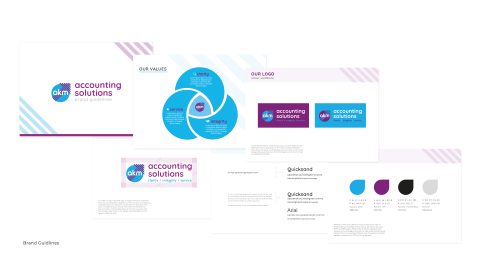
Page 5 - Abstract Creative Studio AKM Client Success Story
P. 5
        brand guidelines
OUR LOGO
exclusion zone
  OUR VALUES
service
Lorem ipsum dolor sit amet, consectetuer adipiscing elit, sed diam nonummy nibh euismod tincidunt ut laoreet dolore magna
clarity
Lorem ipsum dolor sit amet, consectetuer adipiscing elit, sed diam nonummy nibh euismod tincidunt ut laoreet dolore magna
      integrity
Lorem ipsum dolor sit amet, consectetuer adipiscing elit, sed diam nonummy nibh euismod tincidunt ut laoreet dolore magna
OUR TYPEFACE
Our preferred version is the primary logo. However these are the alternative colour ways that can be used to create emphasis in marketing and where a solid background will create more impact, always make sure there is sufficient background contrast to meet accessibility standards.
  OUR COLOURS
 OUR LOGO
colour variations
     To make our logo clear and easy to read, a minimum protective exclusion zone has been created around it. This area is created by scaling the arrow to 30% of it’s current size. The exclusion zone itself is invisible, and you should never see the elements that
help to create it. Nothing that detracts from the logo, like other lines of type, other logos or the edges of photographs, should appear inside this area.
  Our logo typeface is Quicksand in bold
Circe is our Primary typeface for content and should be used on all marketing communications. It should never be set less than 8 point (no less than 6 point for captions). Bold and Italic can be used for emphasis within body copy.
In instances where Circe is not available please use Arial
Quicksand
ABCDEFGHIJKLMNOPQRSTUVWXYZ abcdefghijklmnopqrstuvwxyz
Quicksand ABCDEFGHIJKLMNOPQRSTUVWXYZ abcdefghijklmnopqrstuvwxyz
Arial
ABCDEFGHIJKLMNOPQRSTUVWXYZ abcdefghijklmnopqrstuvwxyz
    C- 83 M- 1 Y- 0 K- 0 R- 0 G- 169 B- 224 Pantone - 2995 #00ADE9
C- 48 M- 96 Y- 0 K- 0 R- 152 G- 29 B- 151 Pantone - 254 #992785
C- 0 M- 0 Y- 0 K- 100 R- 29 G- 29 B- 27 Pantone - Process Black #1D1D1B
C- 0 M- 0 Y- 0 K- 20 R- 218 G- 218 B- 218 Pantone - #DADADA
AKM has a distinctive palette of colours. These colours help to differentiate our brand. Our primary colours are shown here using CMYK and RGB values. Always make sure there is good contrast between text and background colours to meet accessibility standards. Colour tints are not used very often but only in exceptions and when needed – anywhere from 100% to 1% can be used.
        Brand Guidlines


