Page 13 - Fujifilm Exposure_40 Golden Compass_ok
P. 13
        THE DP VIEW
MATT GRAY
A fter chatting with Coky, I was keen for it not to have a
heavy, leaden quality although it’s perhaps a slight- ly darker take on the Oliver
Twist we usually know. The one- dimensional approach would have been to say: let’s make it dark without also wanting to make it rich, vivid and textural.
I’m bringing in quite a few mod- ern colours – greens, chrome oranges – to suggest that the story, of child- hood and slavery, also has a sort of contemporary resonance.
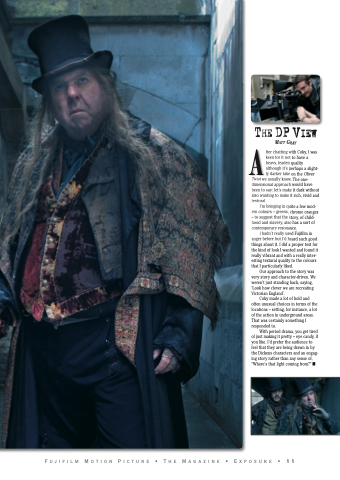
I hadn’t really used Fujifilm in anger before but I’d heard such good things about it. I did a proper test for the kind of look I wanted and found it really vibrant and with a really inter- esting textural quality to the colours that I particularly liked.
Our approach to the story was very story and character-driven. We weren’t just standing back, saying, ‘Look how clever we are recreating Victorian England’.
Coky made a lot of bold and often unusual choices in terms of the locations – setting, for instance, a lot of the action in underground areas. That was certainly something I responded to.
With period drama, you get tired of just making it pretty – eye candy, if you like. I’d prefer the audience to feel that they are being drawn in by the Dickens characters and an engag- ing story rather than any sense of, “Where’s that light coming from?” ■
                        Fujifilm Motion Picture • The Magazine • Exposure • 11


