Page 52 - additude brochure
P. 52
 52
    Client: STRUXXUR
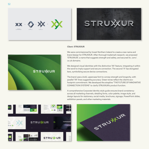
We were commissioned by Invest Northern Ireland to create a new name and brand design for STRUXXUR. After thorough trademark research, we proposed ‘STRUXXUR,’ a name that suggests strength and safety, and secured its .com/. co.uk domains.
We designed visual identities with the distinctive ‘XX’ feature, integrating it within the word to imply support and secure connection. The second ‘X’ has elongated bars, symbolizing secure device connections.
The brand uses a bold, uppercase font to convey strength and longevity, with parallel ‘XX’ lines suggesting accuracy. Green tones reflect the client’s eco- footprint commitment. We developed the strapline “THE FUTURE OF INNOVATIVE CONNECTION SYSTEMS” to clarify STRUXXUR’s product function.
A comprehensive Corporate Identity style guide ensures brand consistency across all marketing channels, detailing fonts, color palette, image style, and design layouts for stationery, social media, brochures, signage, PowerPoint slides, exhibition panels, and other marketing materials.


