
Page 73 - The Decorative Painter Winter 2016
P. 73
PAINTING TIP
ACRYLIC
DECORATIVEPAINTERS.ORG
The Decorative Painter • ISSUE NO. 4, 2016 71
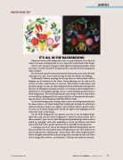
IT’S ALL IN THE BACKGROUND
Experimentation with background colors is a good refresher to see how the colors we choose as backgrounds are very important to final look of the design. When I start a project, I began to think about the background colors. There are choices to make; should the background be a stained (natural) background,
white or black?
First I stained a practice board and painted the pattern on the stained board.
Although it was nice, there wasn’t that pop of color for which I was looking. Traditionally, Kolasca paintings have been done on whitewashed walls to brighten up the interiors of the home. Today paintings can be seen on the exterior of white walled homes to decorate. Most Kolasca embroideries and porcelain designs are also on white backgrounds but embroidered designs that decorate the Hungarian national costumes are on black or dark backgrounds. I decided to try two sample paintings: one on a white background and one on a black background. The trial of painting the same design with the same palette on two different backgrounds was a good refresher to demonstrate how paint-
ings do relate to the background and offer different looks.
On the black background, shading colors sank to the background quite fast.
In some instances, the black background would poke through the painting to add to the shadow. I had to use a lighter value of darker colors to have the shad- ows show on the black background. Overall, the lighter value highlights are the colors that “pop” in the design.
On the white background, the opposite was true. It was the lightest high- lights that sunk into the white background. I found the darker colors had a more prevalent “pop” on the white background painted design. Both surfaces ended up “popping” with color exploding to reveal the Kolasca-style floral quite nicely and it was a good experiment to try the different backgrounds.
I encourage you to try this or any design on different backgrounds and see for yourself how the same palette may need adjusting to suit what look you are after. To ask me now, which I prefer...I must admit, I like them equally because I love the brightly colored folk art floral design that just pops up with rich colors of red, orange, blue, yellows...and lavenders. I do hope you enjoy this journey.
