Page 41 - LuxeFactor Magazine BC Edition
P. 41
     The journey of pink as the color representing breast cancer awareness began in the early 1990s. The movement gained momentum largely due to the advocacy of the Susan G. Komen Foundation, founded in 1982 by Nancy Goodman Brinker in memory of her sister, Susan G. Komen, who lost her battle with breast cancer. The foundation's efforts to promote early detection and research into breast cancer led to the establishment of various fundraising events, most notably the Komen Race for the Cure.
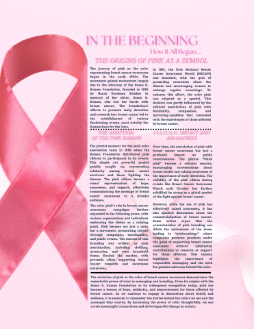
The pivotal moment for the pink color association came in 1992 when the Komen Foundation distributed pink ribbons to participants in its events. This simple yet powerful symbol quickly caught on, representing solidarity among breast cancer survivors and those fighting the disease. The pink ribbon became a visual representation of hope, awareness, and support, effectively communicating the message of breast cancer awareness to a broader audience.
The color pink’s role in breast cancer awareness campaigns further expanded in the following years, with various organizations and individuals embracing the ribbon as a rallying point. Pink became not just a color but a movement, permeating culture through campaigns, merchandise, and public events. The success of this branding was evident as pink merchandise, including clothing, accessories, and even household items, flooded the market, with proceeds often supporting breast cancer research and awareness initiatives.
In 1991, the first National Breast Cancer Awareness Month (NBCAM) was launched, with the goal of promoting awareness about the disease and encouraging women to undergo regular screenings. To enhance this effort, the color pink was adopted as a symbol. This decision was partly influenced by the cultural associations of pink with femininity, compassion, and nurturing—qualities that resonated with the experiences of those affected by breast cancer.
Over time, the association of pink with breast cancer awareness has had a profound impact on public consciousness. The phrase “think pink” became a cultural mantra, encouraging conversations about breast health and raising awareness of the importance of early detection. The visibility of the pink ribbon during events like Breast Cancer Awareness Month each October has further solidified its status as a global symbol of the fight against breast cancer.
However, while the use of pink has effectively raised awareness, it has also sparked discussions about the commercialization of breast cancer. Some critics argue that the oversaturation of pink branding can dilute the seriousness of the issue, leading to “pinkwashing,” where companies promote products under the guise of supporting breast cancer awareness without substantial contributions to research or support for those affected. This tension highlights the importance of responsible messaging and the need for genuine advocacy behind the color.
    The evolution of pink as the color of breast cancer awareness demonstrates the remarkable power of color in messaging and branding. From its origins with the Susan G. Komen Foundation to its widespread recognition today, pink has become a beacon of hope, solidarity, and empowerment for those affected by breast cancer. As we continue to engage in discussions about health and wellness, it is essential to remember the stories behind the colors we use and the messages they convey. By harnessing the power of color thoughtfully, we can create meaningful connections and drive impactful change in society.


