Page 164 - Mediapedia Mobile
P. 164
                                PART I1 THE PAGE
04_MP_132-171.indd 166-167
6/19/08
8:13:03 AM
MANIPULATING
TYPE AND TEXT
Creating special effects with type and text is possible with Illustrator’s letterform generator, which has specialized vector controls that make it powerful in using type and layout.
kerning and leading
Although word-processing applications are good for routine handling of type and text blocks, only a true vector-based program like Illustrator can achieve the feats depicted on this page.
Kerning is the amount of space between letters, and leading is the amount of space between lines.
containers and paths
type outlines and stroking
Illustrator will fit text into any object or along any path.
Computers bring fresh treatments to letters and words by generating outlines of the letterform contours or
by stroking object paths with different visual effects.
[ 166 ]
CHAPTER 4: ILLUSTRATION [ 167 ]
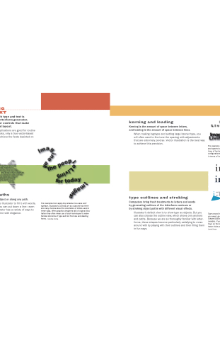
Build an object, and then use Illustrator to fill it with words. Even more useful is that if you can put down a line—even the most twisted one—Illustrator has a variety of ways to make words flow along that line with elegance.
The examples here apply drop shadow to a sans serif typeface. Illustrator’s controls are so nuanced that there are many choices about the orientation of letters used in these ways. When graphics designers talk of original illus- tration they often mean use of such techniques to make familiar elements of type and text find new and dazzling forms. Carolina Correa
Illustrator’s default view is to show type as objects. But you can also choose the outline view, which shows only anchors and paths. Because we are so thoroughly familiar with letter- forms, these shapes become particularly satisfying to mess around with by playing with their outlines and then filling them in fun ways.
Type a word into Illustrator (top). If you highlight
your word, go to the Main Menu, choose Type, and then Create Outline, anchor points and paths will show up (middle). If you ungroup these outlines, you can go to town on the letterforms, treating them with lots of Illus- trator tricks as demonstrated in the treatment (bottom). Jamie Kruse
When making logotype and setting large banner type, you will often want to fine-tune the spacing with adjustments that are extremely precise. Vector illustration is the best way to achieve this precision.
The example above shows both kerning (tight words
and spaced out words) and tracking (big gaps between lines of text and lines jammed together). All of these configurations are legible. But there is a clear difference in terms of impact. Carolina Correa


