Page 54 - Capture magazine May-Jul 21
P. 54
                  JUDGES’ ADVICE
               OUR JUDGES
Abigail Varney Adam Ferguson Adrian Cook
Alex Cearns Anthony McKee Art Streiber Ashley Gilbertson Belinda Richards Cade Martin Daniel Berehulak Ed Kashi
Gary Knight Greg Gorman Ignacio Palacios Jason Ierace John Gollings John Stanmeyer Leah King-Smith
Michael Cook Michael Grecco Mridula Amin Paul Hoelen Paula Bronstein Ponch Hawkes Rachel Mounsey Randal Ford Renée C. Byer Richard Wood Robert Coppa Sally Brownbill Sarah Rhodes Sean Izzard
Steve Wise Tajette O’Halloran Tim Griffith
Tony Hewitt William Long
abigailvarney.com adamfergusonstudio.com adriancookphotography.com houndstoothstudio.com.au anthonymckee.com.au artstreiber.com ashleygilbertson.com frogdogstudios.com.au cademartin.com danielberehulak.com edkashi.com garyknight.org gormanphotography.com iptravelphotography.com.au jasonierace.com gollings.com.au stanmeyer.com staff.qut.edu.au/staff/ l.king-smith michaelcook.net.au michaelgrecco.com mridulaamin.com paulhoelen.com paulaphoto.com ponchhawkes.com.au rachelmounsey.com.au randalford.com reneecbyer.com richardwood.co.nz www.robertcoppa.com thebrownbilleffect.com sarahrhodes.com seanizzard.com 27creative.com.au tajetteohalloran.com timgriffith.com tonyhewitt.com longshots.com.au
■ Itriedtofindworkthatlookedconsidered, studied, and thoughtful. I favoured work that had been developed over a period of time, and work that was qualitatively consistent through the series.
■ It can be helpful to shoot with the storyline in mind, editing as you go along. Don’t repeat the same shot in an edited sequence. When editing for a series, each shot should stand alone as its own powerful image.
■ A successful documentary essay needs to be cohesive in style, light, composition, mood, and storytelling. The photographer should take the time to allow the subject’s story to naturally unfold and translate their unvarnished reality of life. It should be obvious that one photographer made each image. Some portfolios had some very strong single images, but the collection did not hold up cohesively.
■ The strongest portfolios were the ones you could tell had built intimacy with their subjects or with a place.
LANDSCAPE
■ Too many mixed vertical and horizontal which detracted from the idea of a folio.
■ Far too many entries were diminished by simply presenting exactly the same scene three times. Successful portfolios displayed consistency across the set, but invited the viewer to engage with each image individually as well.
■ If you’re going to enter a portfolio from a single location (especially if it’s all from the same photo shoot), then ideally you want to introduce some
diversityinangle,perspective,andthought process, or technique to diversify the set.
OPEN
■ Being creative with your thought process and then being able to carry that through is what makes a great image.
■ The portfolios that caught my eye were well constructed and cohesive either through storytelling or the ability to aesthetically bring images together. There were a lot of submissions that had a mix of images that didn’t work together as a portfolio and may have done better as stand-alone images.
■ The folios that really stood out presented with a genuine sense of innovation through an exploration of a concept or a theme. While technique is important, the ideas behind the images are often what makes them most memorable and compelling, and what can tie them well together as a folio.
PORTRAIT
■ Thetopportfoliosshowedacohesiveness,not just in subject matter, but in tonality and composition. They were thoughtful images that made me stare deeper into the work.
■ When photographing children, ensure they are comfortable and willing subjects.
■ No tricks. The more honest, the more direct, the better.
■ Take your time, connect with the subject, look for the moments in between.
■ Pictures with people in them aren’t necessarily portraits. A portrait is more than just a pictorial representation of a person.
■ Asuccessfulportraitgivesthevieweradeeper understanding of the subject, adds dimension to the subject’s story and gives the viewer pause, forcing the viewer to linger on the portrait and want to know more about the subject.
SINGLE SHOT
■ Many entrants would do well to ask the questions, “What story do I want to tell?” and “Does this picture succeed in telling that story?”
■ I tended to lean more towards images that felt genuine, unique, and sparked curiosity.
■ For me, it’s all about the composition. If it doesn’t work upside down, don’t enter it.
■ Visual impact is important to catch the initial attention of the judges, reinforced by the use of excellent camera craft and technique. Beyond this, it was the images that presented with a significant level of visual communication, emotion, and originality that really stood out from the rest. Bold, simple design, striking use of colour and well-thought-out compositions also moved a number of images right up to the top of the category.
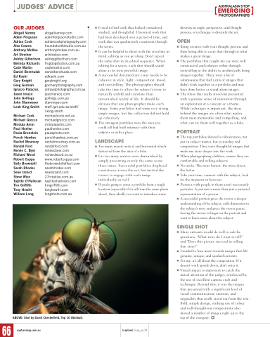
  ABOVE: Shot by David Chesterfield, Top 10 (Animal).
     66
capturemag.com.au
[capture] may_jul.21


