
Page 67 - Packaging News Magazine Sep-Oct 2019
P. 67
September-October 2019
www.packagingnews.com.au BRAND & PACK DESIGN
67
the design of a product’s packaging drives their purchasing decision, and therefore, brand owners and de- signers need to make sure packaging is clear, direct and desirable.
Clutter that impinges upon the aesthetic and clarity of the brand message, such as ‘new and improved’ flashes, product features and speci- fications, can still be accessible yet hidden on pack.
“QR codes can be a cost-effective way to give consumers, especially millennials, product information quick- ly, if they want it,” says Harcus. “Mak- ing the scanning accessible has re-in- vigorated the popularity of QR codes.”
Augmented reality is another way to connect and win consumers’ hearts and minds, she says. “All of this pro- pels and fosters post-purchase cus- tomer engagement, so the consumer will be more likely to buy again.”
EMBEDDING THE STORY
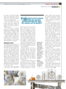
One of Harcus Design’s ongoing pack- aging and branding design projects is for premium body care brand Maine Beach. Each year, Maine Beach releas- es at least one new product range, which uses a hero ingredient, sourced from a particular place of origin around Australia. Harcus Design created a number of touchpoints for the ingredi- ent of choice – Ligurian honey from Kangaroo Island – including a crisp white hexagonal box in various sizes and iterations. It uses white, uncoated, embossed, textured paper stock with graphics “rich in calligraphic detail”, as well as tactile black gloss UV and highlights of gold foil. The design was also translated onto metal pump bot- tles and embossed tins.
Harcus says recent research found some customers select and purchase
Packaging that is rich in sensory detail helps the consumer perfectly envision the story, the contents and its benefits.”
portfolio, and we saw the opportuni- ty to visually show the Barossa region through an illustrated scheren- schnitte – the folk art of papercutting – which dovetailed into their Euro- pean heritage.”
To segue into the next tier of wines in the folio, Harcus Design narrowed the story to particularly talk about the winery’s place, which remains nestled within the bluestone quarry in the Barossa foothills, surrounded by vineyards. The middle range of Bethany Wines was named Blue Quarry and each wine has its own watercolour illustration, “so the range becomes an intense celebration of blue – from Bethany Blue through cyan, to indigo,” says Harcus.
The top tier of Bethany Wines, GR and LE, had their stories expressed in words, as a point of distinction from the other two ranges. Both are a testament to the past generations of Bethany Wines – GR, for the fifth generation brothers, Geoffrey and Robert Schrapel – and LE, a tribute to the fourth generation, Lawrence and Edna Schrapel.
“We used a circular medallion shape for the front labels and the back labels feature variable bottle numbering on elegant reverse taper bottles, with silkscreened branding and wax closures,” says Harcus. “This elevates the package in line with its wine quality credentials.”
It is a challenge to attract interest, hold consumers’ attention and main- tain brand vitality, but it can be achieved, says Harcus.
Along with a powerful story, the ways consumers engage with a brand’s touchpoints not only evoke an emo- tion and experience, but also ensure they keep coming back. ■
BROUGHT TO YOU BY
these items as a décor object for their homes. “Items such as tissue boxes, hand wash dispensers or cushion covers are an affordable and accessi- ble means to instantly alter personal spaces,” Harcus tells PKN. “Creating engaging content that aligns and sup- ports the themes for Maine Beach allowed us to transition the sales suc- cess of this range into further exten- sions, such as the home and fragrance arena. Online, we prompt the need for consumers to want to touch, try out and experience the products with animated gifs of dripping honey, and visuals of the ingredients to evoke the taste. The packaging and the prod- ucts visually marry.”
Harcus Design also focuses on wine labels, with the team recently redesigning Barossa Valley-based Bethany Wines. The 165-year-old winemaker had its logotype reshaped, and a key signature colour palette es- tablished, reclaiming the ‘Bethany Blue’ – making it the hero with an ac- cent of warm gold. The Bethany Wines portfolio was also structured into three tiers.
“We used the different ranges as an opportunity to focus on a different part of the brand’s story in each tier, without trying to bombard and tell everything at once,” says Harcus. “Entry level wines are the friendly, accessible introduction to the wine
FACING PAGE: The Bethany Wines labels showcase the signature blue colour palette and an illustrated papercutting technique
– scherenschnitte – which speaks to the brand’s European heritage. The top tier wines’ stories
are expressed in words on the labels.
BELOW:
The beautifully crafted Ligurian honey packaging is retained as home décor by consumers.
