
Page 73 - Packaging News Magazine Sep-Oct 2019
P. 73
September-October 2019
www.packagingnews.com.au BRAND & PACK DESIGN
73
BROUGHT TO YOU BY
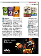
3PERCEPT DEBUGS MYTH
FOR PET FOOD PACK
Sustainable pet food brand Buggy Bix hopes to reverse the stigma at- tached to its key ingredient – bugs. The team at Percept was engaged to create a playful packaging design to communicate the nutritional value of the insect-based dog treats, as well as the positive impact the prod- ucts can have on the planet.
The cheeky packaging plays on the sensory parts of the dog’s face used to distinguish and taste food, with die-cuts used to add interest and standout, while giving consum- ers visibility of the product inside.
Percept senior designer Paula McLarnon says making the product visible was imperative to make peo- ple comfortable with the ingredients at every touchpoint. “Using a be- spoke die-cut of a tongue is a fun and engaging way to communicate that dogs love eating bugs,” she says.
“Seeing the product helps to re- duce inhibitions and preconcep- tions of what the product will look like and encourages purchase... and is also a great way to differentiate be- tween the products on shelf, such as changing the placement, shape and action of the tongue.”
As insect pet treats are new to the Australian market, there were con- cerns that people may be hesitant to feed insects to their pets, hence, the illustrative approach to help ‘debug’ the ingredients, soften the subject matter, and add the ‘cute factor’, ac- cording to McLarnon.
“Tone of voice and humour were carefully considered to build aware- ness of the nutritional value of in- sects and the sustainability of the product in a friendly and approach- able way. The tagline ‘Sweet Satis- faction’, alongside the tongue catch- ing the bug, is a great visual cue to showcase that eating bug protein is
a very natural thing for a dog to do.” Given the environmentally friendly value proposition of Buggy Bix, McLar- non says efforts were made to ensure the packaging material was recyclable while maintaining a sufficient mois- ture and oxygen barrier. Packs were
4
design agency Saltmine to create a new brand identity for the Karicare Toddler range, with the objective of driving sustainable growth through- out 2019 and beyond.
The new look features a natural design, with a bespoke watercolour illustration of rolling hills and cows, and a hand-drawn iteration of the Karicare Toddler logo.
printed by Packaging People.
NATURE CENTRES KARICARE
TODDLER REDESIGN
Karicare Toddler is one of the key
brands in the specialised nutrition
portfolio under the Nutricia master
brand. The company worked with
