
Page 700 - Excel 2013 All-in-One For Dummies
P. 700
682 Sorting and Filtering the Pivot Table Data
Excel then displays M in the Gender Report Filter field instead of the default (All) and replaces the standard drop-down button icon with a cone-shaped filter icon, indicating that the field is currently being filtered to show only some of the values in the data source.
Filtering individual Column and Row fields
The AutoFilter buttons on the Column and Row fields enable you to filter particular groups and, in some cases, individual entries in the data source. To filter the summary data in the columns or rows of a pivot table, click the Column or Row field’s filter button and start by deselecting the check box for the (Select All) option at the top of the drop-down list to clear its check mark. Then, select the check boxes for all the groups or individual entries whose summed values you still want displayed in the pivot table to put check marks back in each of their check boxes before you click OK.
As when filtering a Report Filter field in the table, Excel replaces the standard drop-down button icon displayed in the particular Column or Report field with a cone-shaped filter icon. This icon indicates that the field is currently being filtered and only some of its summary values are now displayed in the pivot table. To redisplay all the values for a filtered Column or Report field, you need to click its filter button and then select the (Select All) option at the top of its drop-down list before you click OK.
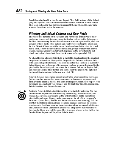
Figure 2-8 shows the original sample pivot table after formatting the values (with a number format that uses a comma as a thousands separator and displays zero decimal places) and then filtering its Gender Filter Report Field to women by selecting F (for Female) and its Dept Row Field to Accounting, Administration, and Human Resources.
Notice in Figure 2-8 that after filtering the pivot table by selecting F in the Gender Filter Report field and selecting Accounting, Administration, and Human Resources departments as the only Dept Row fields, the filtered pivot table no longer displays salary summaries for all of the company’s locations. (Santa Rosa, Seattle, and Atlanta locations are missing.) You can tell that the table is missing these locations because there are no women employees in the three selected departments and not as a result of filtering the Location Column Labels field because its drop-down button still uses the standard icon and not the cone filter icon now shown to the right of the Gender Filter Report and Dept Row Labels fields.
