
Page 41 - Advertising Annual 55
P. 41
THE VOORHES
for a recent Atlantic cover photo, “she doesn’t say no to anything,” says Emily Kimbro, art director at Texas Monthly. “She’s more resourceful than anyone I’ve ever met.”
And both are fearless. For a while, Finlay and Voorhes kept a 50-gallon tank of liquid nitrogen on hand just to freeze stuff and blow it up. There’s no doubt that they egg each other on, especially when it comes to ideas. More often than not, the concept is up to Voorhes. When it comes to project execution, there’s a well-orchestrated division of labor between Finlay and Voorhes: she handles food and props, he handles light and photographs, both retouch in Photoshop. It’s a system that allows for several projects to be happening at once, one that has helped their work “elevate in ambition and execution,” writes Caleb Bennett, design director at Condé Nast Traveler. When it comes to ideas, however, their creative resources meld.
They’ll head to a restaurant with their dogs and their sketchpads, order margaritas, and riff. One person utters
Left: “This was one of two images made for a Details magazine article about which was best, cold-press juicing methods or methods that use blades for extraction. The argument against the blades showed that friction from the blades causes heat, which destroys some of the juice’s nutrients. The exaggerated juice spray and freshness of the cold press was contrasted against smoldering blender blades.” Rockwell Harwood, creative director; Stacey DeLorenzo, photo editor; Details, client
“One of four or five different images we shot for a Details article about pescatarian diets, this was a labor of love that required lots of wire to get the fish to hold together. The whole time, our two bulldogs were running underfoot, trying to get the fish that fell off set before we got it. The magazine went with a simple filet on white for publication. This image, however, went on to win several awards, including being accepted into the Communication Arts Photo Annual.” Rockwell Harwood, creative director; Stacey DeLorenzo, photo editor; Details, client.
“Darhil Crooks at the Atlantic sent us the text for a story called ‘The Tragedy of the American Military.’ As we started brainstorming, the idea of classic green plastic army men—iconic and strong, but knocked over and scattered—rose to the top. After the idea was approved, we realized we needed to find vintage army men that were not only molded with better detail and facial expressions than today’s plastic versions, but also not completely marred by years of play. Thankfully, there’s Etsy. We bought several lots of vintage army men and sorted through them until we found enough to populate the grid.” Darhil Crooks, creative director; The Atlantic, client.
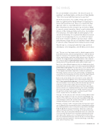
This page: “For the past year, we’ve shot the recurring ‘What’s Inside’ page for WIRED magazine. For July 2015, the item was fireworks. The contents of the rocket were removed, and it was lightly stuffed with cotton batting for smoke. We used firecracker wicks for sparks.” Anna Goldwater Alexander, photo editor; WIRED, client.
“Prevention contacted us with a story about pain and how people experi- ence it differently. We came up with the idea of casting hands in plaster, then inflicting extreme cases of each pain test upon them. The hand in the ice block was frozen the day before. Adam took a clean base capture of the prop and lit the ice to bring out its various facets and surfaces. Then, dry ice was packed behind the hand so it could not be seen, but would still allow frost to build. Adam patiently waited and took capture after capture over a 30-minute period as frost formed, bits of ice melted and white vapor came off the dry ice. He then layered his favorite elements together to create the final image.” Jackie Ney, photo editor; Prevention, client.
Communication Arts | commarts.com 41
