
Page 62 - Advertising Annual 55
P. 62
CHICAGO DESIGNERS
62
Illustration Annual 2016
an ampersand, rendered slightly distressed, based on Le Corbusier Regular (which, contrary to its name, was not designed by the architect, but developed from an early 20th-century zinc stencil set).
“My personal work and my client work are merging together,” he says. “At first I tried to keep them separate, but clients started asking for that scrappier, hand-drawn feel.”
So is that what distinguishes Chicago style today? Democratic, open to influence, but grounded in discipline? Hudson isn’t sure. “Everything around you inspires what’s happening in your work,” he muses. “I’ve been here so long, I don’t know any different. But there’s definitely a Midwestern thing, an ability to try new things, because why not? We kind of exist in our own little world here.
“And anyway, the reason I do design is because I’m not good at talking about it.”
Activating the space: Jeremiah Chiu
and Renata Graw
In its seven years of existence, the studio Plural, opened by Jeremiah Chiu and Renata Graw, had an outsized impact on Chicago’s design scene, spanning media and earning eyes with an idiosyncratic take on serious fun. Chiu and Graw are moving on in their careers, Chiu with Studiochew in Los Angeles, and Graw with Normal in Chicago. But their effect has been extraordinary, observes Chicago designer Rick Valicenti, who describes them as “a duet that continues to set fire to the fringes.”
Valicenti characterizes Plural’s impact as prescient: “What Jeremiah and Renata are doing has the potential to ripple.”
The Brazilian-born Graw defines where the pebble falls and the ripples begin: “Never define the format before you go on the journey. ...We’re more interested in making work honest than trying to be ‘original.’ Defining the question correctly and answering it honestly is what makes it original.”
The city’s tightly knit creative community offers answers, as it leaps barriers between designing, building, playing and performing—the “modes and practices where the disciplines inform each other,” articulates Chiu, a native Chicagoan. So Plural’s output has come in all forms, from a precedent- setting poster synthesizer for the 150th anniversary of the School of the Art Institute of Chicago (SAIC) to optical effects in animation, video and print.
Graw and Chiu were tasked with creating SAIC’s identity to help the school’s yearlong celebration. The designers devel- oped online graphical software that enables the school’s internal design team to build a family of products, with related identities, tailored to specific events in the anniversary year. Going several dimensions beyond a logo, the software generates complete poster designs with its own set of rules and content—in effect, the software incorporates both graphical elements and a virtual “brand manual” that show how visual expression has changed over the school’s 150 years.
The identity reflects the designers’ convictions. Interactive designer Ricardo “Buddy” Bojorquez, who collaborated with Chiu and Graw on the project, says, “In any given project you can only control so much. At some point, you have to let go and let someone else steer the ship.”
Like most of Plural’s output, the SAIC 150th anniversary identity is characterized by a fascination with geometry, spatial relations and modernist design thinking that express how, in Graw’s words, “restrictions yield infinite variations.” It’s an observation that could have come from any of the gifted improvisers in Chicago’s jazz history. “We’ve been influenced by all those headstrong visions about the emer- gence of the new,” says Chiu, himself a performer and an improviser on synthesizers and keyboards. “Our impulse is to take a simple thing and make it go as far as it can go.”
Driven by rhythm: John Pobojewski
“I’ve always been a musician,” says John Pobojewski, a principal
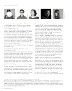
This page: Cody Hudson. Jeremiah Chiu. Renata Graw. John Pobojewski. Jennifer Mahanay.
Right: “I was approached by Nike to work on the graphic design elements surrounding Nike’s involvement in the Bank of America Chicago Marathon 2012. This system included a wordmark, a type system, icons and supporting graphic shapes.” Cody Hudson, designer; Nike, creative direction/client.
“Lumpen is an independent critical arts and culture magazine published by the Public Media Institute three to four times a year, with a circulation of 10,000 to 15,000 copies per issue. It can be found in hundreds of outlets in Chicago and across the United States.” Alexa Viscius, designer; Jeremiah Chiu/Renata Graw, creative directors; Public Media Institute, client.
© Jared Eberhardt
© Alexa Viscius
© Joe Mazza
© Thea Volk
© Devin Ehrenfried
