
Page 26 - Advertising Annual 57
P. 26
TYPOGRAPHY
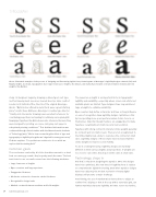
Above: illustrated examples of the process of designing and fine-tuning legible fonts, featuring two of Monotype’s legibility designs—Amasis (left) and Malabar (right). As shown, typographers favor larger lowercase x-heights, like Amasis, and markedly noticeable contrasts between medium and bold weights, like Malabar.
study. Its designers began by drawing on Monotype’s vast type and font development resources, housed about 30 miles south of London in its Salfords office, the site of the original Monotype Works. “Optical sizes offered in metal fonts were a great starting place,” recalls Steve Matteson, Monotype’s creative type director. “Small point size master drawings were excellent references for considering proportions and spacing for relatively coarse pixel grids. Newspaper typefaces like Nimrod were also referenced because they were designed for printing on coarse, dull, gray-cast paper in suboptimal printing conditions.” This firsthand information was confirmed through clinical studies with the Massachusetts Institute of Technology (MIT). “We’ve been researching the effect of type and typography on legibility alongside MIT’s AgeLab for many years now,” Chahine explains. “I hope that we continue to do so while we explore this fascinating field.”
Common goals
The conclusions reached by all of the foundries amount to a dead heat on a merry-go-round—they’re pretty much the same. The best text fonts for use on small screens have the following attributes:
• Large lowercase x-heights
• Open counters and large apertures
• Exaggerated features
• Moderate contrast in character stroke thickness
• Recognizable design traits
• Marked contrast between medium and bold weights
The lowercase x-height is an important factor in typographic legibility and readability—especially where screen real estate and available pixels are limited. Type designers have long embraced large x-heights to optimize readability.
Open counters help define a character and have a strong influence on ease of recognition. New legibility designs capitalize on this by incorporating more open apertures where forms close in on themselves. Important design features are exaggerated to make typefaces recognizable at small sizes and low resolution.
Typefaces with strong contrast in character stroke weights generally do not work well on small screens. There are not enough pixels in the limited digital real estate to reproduce the contrast at small sizes. Legibility designs of these styles have increased hairline stroke weights to improve screen fidelity.
To aid in creating hierarchy, legibility designs are markedly different in their various weights and proportions. If weights are too close to each other, they may look the same at small sizes.
Technology steps in
And that’s only about designing the typeface. Once the designs have been optimized, this new breed of legibility fonts is subject to comprehensive digital fine-tuning. Even when typeface designs have been adjusted, the modest resolution of many digital displays still presents a major challenge.
Font hinting, the use of mathematical instructions to adjust an outline font’s display so that it lines up with a rasterized grid, can further maximize character legibility. At lower screen resolutions,
28 Advertising Annual 2016
