Page 31 - Catherine's LaSalle Entry Portfolio FB
P. 31
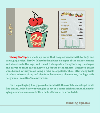
        LOVE 100% TASTY 150% PASSION 125% SWEET 90% SALTY 10% HAPPINESS 200% JOY 250%
          ToP
Cherry On Top is a made up brand that I experimented with for logo and packaging design. Firstly, I sketched my ideas on paper of the main elements and structure in the logo, and traced it alongside with optimizing the shapes and curves to make it look neater. As for the color scheme, I believed that it would stand out way more using a retro color pallete. Then, after many trials of colors mix-matching and also font & elements placements, the logo is fi- nally done - resulting in a retro vibe.
For the packaging, I only played around with the available mockup I could find online. Added a few rectangles to act as a paper sticker around the pack- aging, and also made a nutrition facts sticker with a fun twist.
branding & poster


