
Page 15 - Demo
P. 15
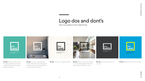
  Logo dos and dont’s Here is some guidance on how to apply the logo.
                                                                                                                                                                                          Do use the logo on flat colours but please make sure they are complimentary and the logo is legible and visible
Do use our logo on photography (black/white and colour) but please always keep in mind the legibility of our most important asset
Do use our logo on a graphic pattern
Do not place our logo onto imagery or coloured backgrounds/patterns which make it difficult to read
Do not distort the proportion of our logo
Do not change the colours of our logo
 15
This LandTM Brand Guidelines DEC 2017. V1
