
Page 6 - N&C Synergy
P. 6
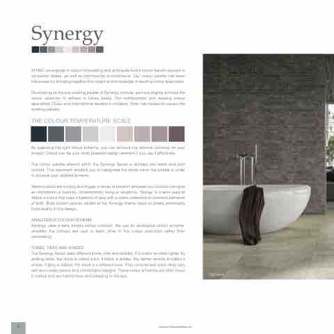
Synergy
At N&C we engage in colour forecasting and anticipate future colour trends relevant to consumer tastes, as well as commercial environments. Our colour palette has been influenced by bringing together the insight and knowledge of leading colour specialists.
Developing on the pre-existing palette of Synergy colours, we have slightly evolved the colour selection to adhere to future tastes. Our collaboration with leading colour specialists, Dulux and international leaders in mosaics, Sicis, has helped to secure the existing pallette.
THE COLOUR TEMPERATURE SCALE
By selecting the right colour scheme, you can achieve the desired outcome for your project. Colour can be your most powerful design element if you use it effectively.
The colour palette offered within the Synergy Series is divided into warm and cool colours. This approach enables you to categorise the tones within the palette in order to achieve your desired scheme.
Warm colours are inviting and trigger a sense of comfort, whereas cool colours can give an impression of serenity, contemporary living or elegance. ‘Greige’ is a term used to define a colour that uses a balance of grey with a warm undertone to combine elements of both. Bold accent colours added to the Synergy theme helps to create personality individuality in the design.
ANALOGOUS COLOUR SCHEME
Synergy uses a fairly simple colour concept. We use an analogous colour scheme, whereby the colours are next to each other in the colour spectrum rather than contrasting.
TONES, TINTS AND SHADES
The Synergy Series uses different tones, tints and shades. If a colour is made lighter by adding white, the result is called a tint. If black is added, the darker version is called a shade. If grey is added, the result is a different tone. They complement each other very well and create serene and comfortable designs. These colour schemes are often found in nature and are harmonious and pleasing to the eye.
www.nichollsandclarke.com
Highland
6
