
Page 21 - Black Range Naturalist Oct 2020
P. 21
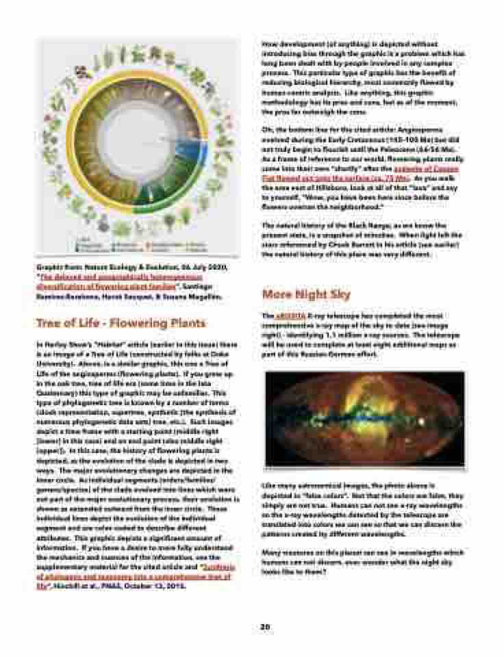
    Graphic from: Nature Ecology & Evolution, 06 July 2020, “The delayed and geographically heterogeneous diversification of flowering plant families”, Santiago Ramírez-Barahona, Hervé Sauquet, & Susana Magallón.
Tree of Life - Flowering Plants
In Harley Shaw’s “Habitat” article (earlier in this issue) there is an image of a Tree of Life (constructed by folks at Duke University). Above, is a similar graphic, this one a Tree of Life of the angiosperms (flowering plants). If you grew up in the oak tree, tree of life era (some time in the late Quaternary) this type of graphic may be unfamiliar. This type of phylogenetic tree is known by a number of terms (clock representation, supertree, synthetic [the synthesis of numerous phylogenetic data sets] tree, etc.). Such images depict a time frame with a starting point (middle right [lower] in this case) and an end point (also middle right [upper]). In this case, the history of flowering plants is depicted, as the evolution of the clade is depicted in two ways. The major evolutionary changes are depicted in the inner circle. As individual segments (orders/families/ genera/species) of the clade evolved into lines which were not part of the major evolutionary process, their evolution is shown as extended outward from the inner circle. These individual lines depict the evolution of the individual segment and are color-coded to describe different attributes. This graphic depicts a significant amount of information. If you have a desire to more fully understand the mechanics and nuances of the information, see the supplementary material for the cited article and “Synthesis of phylogeny and taxonomy into a comprehensive tree of life”, Hinchill et al., PNAS, October 13, 2015.
How development (of anything) is depicted without introducing bias through the graphic is a problem which has long been dealt with by people involved in any complex process. This particular type of graphic has the benefit of reducing biological hierarchy, most commonly flawed by human-centric analysis. Like anything, this graphic methodology has its pros and cons, but as of the moment, the pros far outweigh the cons.
Oh, the bottom line for the cited article: Angiosperms evolved during the Early Cretaceous (145-100 Ma) but did not truly begin to flourish until the Paleocene (66-56 Ma). As a frame of reference to our world, flowering plants really came into their own “shortly” after the andesite of Copper Flat flowed out onto the surface (ca. 75 Ma). As you walk the area east of Hillsboro, look at all of that “lava” and say to yourself, “Wow, you have been here since before the flowers overran the neighborhood.”
The natural history of the Black Range, as we know the present state, is a snapshot of minutiae. When light left the stars referenced by Chuck Barrett in his article (see earlier) the natural history of this place was very different.
More Night Sky
The eROSITA X-ray telescope has completed the most comprehensive x-ray map of the sky to date (see image right) - identifying 1.1 million x-ray sources. The telescope will be used to complete at least eight additional maps as part of this Russian-German effort.
Like many astronomical images, the photo above is depicted in “false colors”. Not that the colors are false, they simply are not true. Humans can not see x-ray wavelengths so the x-ray wavelengths detected by the telescope are translated into colors we can see so that we can discern the patterns created by different wavelengths.
Many creatures on this planet can see in wavelengths which humans can not discern, ever wonder what the night sky looks like to them?
       20
