Page 69 - 2018PARADESTYLEMAGAZINE
P. 69
TERRAZZO IS BACK                                                         A POP OF COLOR


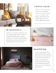
 Terrazzo’s was originally invented in 15                                    Make sure to add a pop of color
 th
 century Venice as a use for discarded                                       to liven up the new neutrals.
 marble remnants. It had a resurgance of                                     Pops of color can also be added

 popularity in the 1970’s and is now making                                  as a contrasting accent wall.
 another strong comeback. It can be found                                    When you get tired of the color,

 adorning everything from counter tops,                                      changing it is easy. Update it
 to floors and walls. It boasts unbeatable                                   yearly to reflect the new palettes.
 durability, eco-friendly materials, simple

 maintenance, and  flexible use and design
 capabilities. Expect to see this material

 more and more in residential environments.

              MUTED PASTELS


              Pastel derivatives in chalky, muted tones, have
              a soothing appeal that brings with them an

              understated vibe that’s perfect for gender
 CURVES AHEAD  neutral rooms and common areas like kitchens

              and bathrooms as they’ll do double duty and
 Furniture with curvilinear cuts is becoming   conceal everyday scuff marks and nicks.
 more popular. It has a cozy organic feel,
 keeping fluid lines that mimic nature. It

 sets the mood to instant comfort and Zen.

                                                                         RICH PEWTER


                                                                            The perfect gray-beige and a rich

                                                                            alternative to all-white walls, pewter

 EARTHY NEUTRALS                                                            paint colors provide an almost blank
                                                                            canvas that’s anything but bland.

 In the busy world of today it’s important to have                          Though it should have been a
 an oasis. Incorporating earthy neutrals into                               standard before it was shortlisted

 your home provide a soothing and relaxing                                  as one of the best paint colors for
 atmosphere. Use shades of burnt orange, green,                             2019, this is one color trend not to be
 warm beiges, and pastels to set the tone.                                  underestimated.


 68                                                                                                                 69

