
Page 84 - Expanded Media & the MediaPlex
P. 84
Expanded Media - and the MediaPlex 84/206
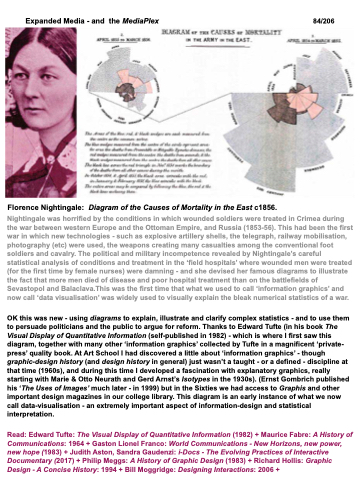
Florence Nightingale: Diagram of the Causes of Mortality in the East c1856.
Nightingale was horrified by the conditions in which wounded soldiers were treated in Crimea during the war between western Europe and the Ottoman Empire, and Russia (1853-56). This had been the first war in which new technologies - such as explosive artillery shells, the telegraph, railway mobilisation, photography (etc) were used, the weapons creating many casualties among the conventional foot soldiers and cavalry. The political and military incompetence revealed by Nightingale’s careful statistical analysis of conditions and treatment in the ‘field hospitals’ where wounded men were treated (for the first time by female nurses) were damning - and she devised her famous diagrams to illustrate the fact that more men died of disease and poor hospital treatment than on the battlefields of Sevastopol and Balaclava.This was the first time that what we used to call ‘information graphics’ and now call ‘data visualisation’ was widely used to visually explain the bleak numerical statistics of a war.
OK this was new - using diagrams to explain, illustrate and clarify complex statistics - and to use them to persuade politicians and the public to argue for reform. Thanks to Edward Tufte (in his book The Visual Display of Quantitative Information (self-published in 1982) - which is where I first saw this diagram, together with many other ‘information graphics’ collected by Tufte in a magnificent ‘private- press’ quality book. At Art School I had discovered a little about ‘information graphics’ - though graphic-design history (and design history in general) just wasn’t a taught - or a defined - discipline at that time (1960s), and during this time I developed a fascination with explanatory graphics, really starting with Marie & Otto Neurath and Gerd Arnst’s Isotypes in the 1930s). (Ernst Gombrich published his ‘The Uses of Images’ much later - in 1999) but in the Sixties we had access to Graphis and other important design magazines in our college library. This diagram is an early instance of what we now call data-visualisation - an extremely important aspect of information-design and statistical interpretation.
Read: Edward Tufte: The Visual Display of Quantitative Information (1982) + Maurice Fabre: A History of Communications: 1964 + Gaston Lionel Franco: World Communications - New Horizons, new power, new hope (1983) + Judith Aston, Sandra Gaudenzi: i-Docs - The Evolving Practices of Interactive Documentary (2017) + Philip Meggs: A History of Graphic Design (1983) + Richard Hollis: Graphic Design - A Concise History: 1994 + Bill Moggridge: Designing Interactions: 2006 +
