
Page 335 - Uros Todorovic Byzantine Painting Contemporary Eyes
P. 335
Chapter VI
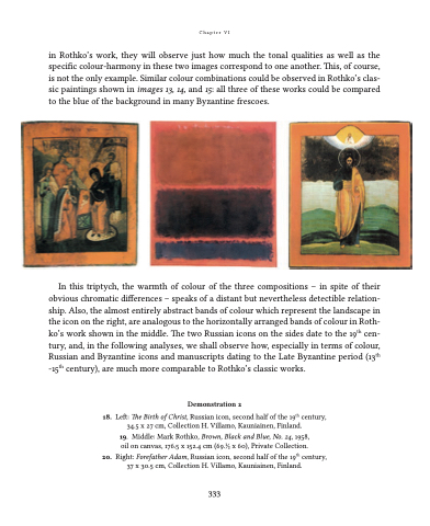
in Rothko’s work, they will observe just how much the tonal qualities as well as the specific colour-harmony in these two images correspond to one another. This, of course, is not the only example. Similar colour combinations could be observed in Rothko’s clas- sic paintings shown in images 13, 14, and 15: all three of these works could be compared to the blue of the background in many Byzantine frescoes.
In this triptych, the warmth of colour of the three compositions – in spite of their obvious chromatic differences – speaks of a distant but nevertheless detectible relation- ship. Also, the almost entirely abstract bands of colour which represent the landscape in the icon on the right, are analogous to the horizontally arranged bands of colour in Roth- ko’s work shown in the middle. The two Russian icons on the sides date to the 19th cen- tury, and, in the following analyses, we shall observe how, especially in terms of colour, Russian and Byzantine icons and manuscripts dating to the Late Byzantine period (13th -15th century), are much more comparable to Rothko’s classic works.
Demonstration 2
18. Left: The Birth of Christ, Russian icon, second half of the 19th century, 34.5 x 27 cm, Collection H. Villamo, Kauniainen, Finland.
19. Middle: Mark Rothko, Brown, Black and Blue, No. 24, 1958, oil on canvas, 176.5 x 152.4 cm (69.1⁄2 x 60), Private Collection.
20. Right: Forefather Adam, Russian icon, second half of the 19th century, 37 x 30.5 cm, Collection H. Villamo, Kauniainen, Finland.
333
