
Page 176 - Duct Tape Marketing
P. 176
160 Part III: Creating and Placing Ads
Keep it simple
Streamline your design to help readers focus on the important points of your
ad. Here are two ways to keep your ad design uncluttered:
ߜ Frame your ad with wide-open space. Isolate your ad from those around
it while providing the visual relief toward which the reader’s eye will nat-
urally gravitate.
ߜ Make your ad easy to follow. As a prospect’s eyes sweep from the
upper-left corner to the bottom-right corner, will he be able to grasp
your message and see your name and logo before exiting to the next
page? If your ad lacks an obvious focal point or if two design elements
compete for dominance, the reader is apt to pass over the ad altogether.
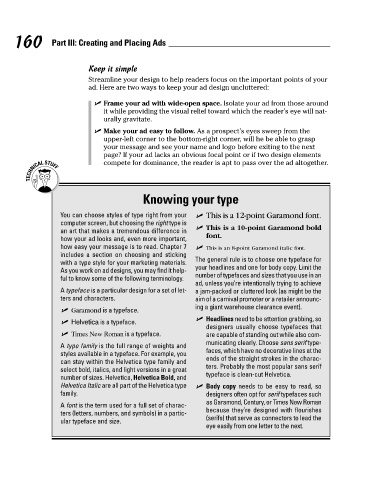
Knowing your type
You can choose styles of type right from your ߜ This is a 12-point Garamond font.
computer screen, but choosing the right type is
an art that makes a tremendous difference in ߜ This is a 10-point Garamond bold
how your ad looks and, even more important, font.
how easy your message is to read. Chapter 7
includes a section on choosing and sticking ߜ This is an 8-point Garamond italic font.
with a type style for your marketing materials.
As you work on ad designs, you may find it help- The general rule is to choose one typeface for
ful to know some of the following terminology. your headlines and one for body copy. Limit the
number of typefaces and sizes that you use in an
A typeface is a particular design for a set of let- ad, unless you’re intentionally trying to achieve
ters and characters. a jam-packed or cluttered look (as might be the
aim of a carnival promoter or a retailer announc-
ߜ Garamond is a typeface. ing a giant warehouse clearance event).
ߜ Helvetica is a typeface. ߜ Headlines need to be attention grabbing, so
designers usually choose typefaces that
ߜ Times New Roman is a typeface. are capable of standing out while also com-
municating clearly. Choose sans serif type-
A type family is the full range of weights and faces, which have no decorative lines at the
styles available in a typeface. For example, you ends of the straight strokes in the charac-
can stay within the Helvetica type family and ters. Probably the most popular sans serif
select bold, italics, and light versions in a great typeface is clean-cut Helvetica.
number of sizes. Helvetica, Helvetica Bold, and
Helvetica Italic are all part of the Helvetica type ߜ Body copy needs to be easy to read, so
family. designers often opt for serif typefaces such
as Garamond, Century, or Times New Roman
A font is the term used for a full set of charac- because they’re designed with flourishes
ters (letters, numbers, and symbols) in a partic- (serifs) that serve as connectors to lead the
ular typeface and size. eye easily from one letter to the next.