Page 69 - IELTS Academic Writing Task 1: The Ultimate Guide with Practice to Get a Target Band Score of 8.0+ In 10 Minutes a Day
P. 69
PIE CHART

          The pie charts below show the average household expenditures in Japan and
          Malaysia in the year 2010.


          Summarise the information by selecting and reporting the main features, and make
          comparisons where relevant.


          ANSWER

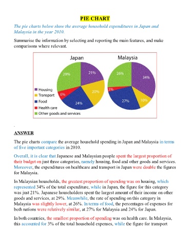
          The pie charts compare the average household spending in Japan and Malaysia in terms

          of five important categories in 2010.

          Overall, it is clear that Japanese and Malaysian people spent the largest proportion of
          their budget on just three categories, namely housing, food and other goods and services.

          Moreover, the expenditures on healthcare and transport in Japan were double the figures
          for Malaysia.

          In Malaysian households, the greatest proportion of spending was on housing, which
          represented 34% of the total expenditure, while in Japan, the figure for this category

          was just 21%. Japanese householders spent the largest amount of their income on other
          goods and services, at 29%. Meanwhile, the rate of spending on this category in
          Malaysia was slightly lower, at 26%. In terms of food, the percentages of expenses for

          both nations were relatively similar, at 27% for Malaysia and 24% for Japan.

          In both countries, the smallest proportion of spending was on health care. In Malaysia,
          this accounted for 3% of the total household expenses, while the figure for transport

