
Page 67 - Process book_Catherine_Byrne
P. 67
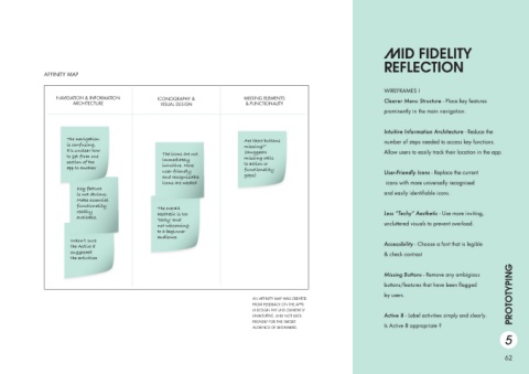
AFFINITY MAP


                          NAVIGATION & INFORMATION                      ICONOGRAPHY &                          MISSING ELEMENTS
                                  ARCHITECTURE                           VISUAL DESIGN                          & FUNCTIONALITY


                               The navigation                                                                  Are there buttons
                               is confusing.                                                                   missing?”
                               It’s unclear how                                                                (Suggests
                               to get from one                            The icons are not                    missing calls
                               section of the                             immediately                          to action or
                               app to another                             intuitive. More                      functionality
                                                                          user-friendly
                                                                          and recognizable                     gaps)
                                                                          icons are needed
                                    Key feature
                                    is not obvious.
                                    Make essential
                                    functionality                       The overall
                                    readily                             aesthetic is too
                                    available.                          ‘techy’ and
                                                                        not welcoming
                                                                        to a beginner
                                                                        audience.
                                 Wasn’t sure
                                 the Active 8
                                 suggested
                                 the activities
                                                                                                                                                                                                                                        PROTOTYPING


                                                                                                                   AN AFFINITY MAP WAS CREATED
                                                                                                                   FROM FEEDBACK ON THE APPS
                                                                                                                   UI DESIGN THE UI IS CURRENTLY
                                                                                                                   UNINTUITIVE, AND NOT USER-
                                                                                                                   FRIENDLY FOR THE TARGET
                                                                                                                   AUDIENCE OF BEGINNERS.
                                                                                                                                                                                                                                    5


                                                                                                                                                                                                                                    62