


Page 72 - Ming Ho Choy (Milo)
P. 72
Personal branding


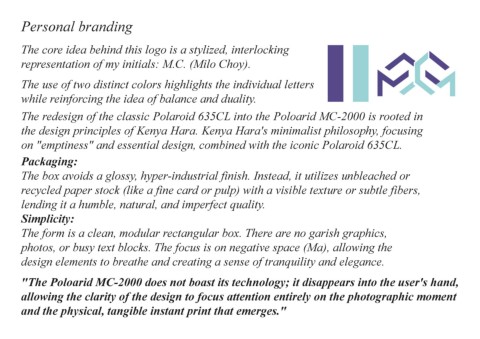
        The core idea behind this logo is a stylized, interlocking

        representation of my initials: M.C. (Milo Choy).


        The use of two distinct colors highlights the individual letters

        while reinforcing the idea of balance and duality.


        The redesign of the classic Polaroid 635CL into the Poloarid MC-2000 is rooted in

        the design principles of Kenya Hara. Kenya Hara's minimalist philosophy, focusing

        on "emptiness" and essential design, combined with the iconic Polaroid 635CL.


        Packaging:

        The box avoids a glossy, hyper-industrial finish. Instead, it utilizes unbleached or

        recycled paper stock (like a fine card or pulp) with a visible texture or subtle fibers,

        lending it a humble, natural, and imperfect quality.

        Simplicity:

        The form is a clean, modular rectangular box. There are no garish graphics,

        photos, or busy text blocks. The focus is on negative space (Ma), allowing the


        design elements to breathe and creating a sense of tranquility and elegance.


        "The Poloarid MC-2000 does not boast its technology; it disappears into the user's hand,

        allowing the clarity of the design to focus attention entirely on the photographic moment

        and the physical, tangible instant print that emerges."

