Page 282 - 20230703_IGAI_MNG_Prototipo
P. 282
Publications

                                                      Grid system

                                                      for laying out texts

                                                      on A4 cover


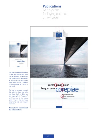
            The texts are justified in relation
            to  the  two  vertical  axes.  This
            can be achieved in two ways:
            the justification is done either
            in  relation  to  the  first  or  last
            letter of the word, or in relation
            to the descender of a letter in
            the word.

            The aim is to create a visual
            link  with the logo (and with
            the  footer  box).  In  doing  so,
            the typography is  “anchored”
            and balanced in its space,
            even if you are free to choose
            alignments  and  use  irregular
            text lines.


            This system is recommended
            but not compulsory.


                                                           67

