Page 355 - 20230703_IGAI_MNG_Prototipo
P. 355

Publications

                                                      Don’ts


                                                                     Frageri


                                        Lorem ipsum
                                        dolor et cum carro                    lorem ipsum
                                                                              dolor et cum
                                        fragum                          esti quis excerunt   carro est
                                                                         Eita dio tenis
                                                                         ut qui coreprae
                                                                          occuptatur
                                        Eita dio tenis
                                        esti quis excerunt
                                        ut qui coreprae
                                        occuptatur

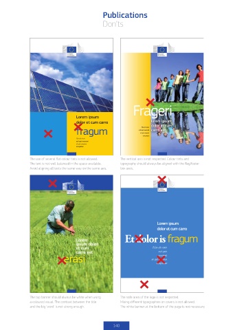
                The use of several flat colour tints is not allowed.  The vertical axis is not respected. Colour tints and
                The text is not well balanced in the space available.   typography should always be aligned with the flag/footer
                Avoid aligning all texts the same way on the same axis.  box axes.


                                                                                 Lorem ipsum
                                                                                 dolor et cum carro
                                                                 Et dolor is fragum
                                        Lorem
                                        ipsum dolor
                                        et cum                                 Eita dio tenis
                                        carro est                                 esti quis
                                  erasi                                       ut qui coreprae
                                                                                  excerunt
                                                                                 occuptatur


                The top banner should always be white when using    The safe area of the logo is not respected.
                a coloured visual. The contrast between the title    Mixing different typographies on covers is not allowed.
                and the big ‘word’ is not strong enough.       The white banner at the bottom of the page is not necessary.


                                                           140
   350   351   352   353   354   355   356   357   358   359   360