
Page 2 - DTA_Style Guide
P. 2
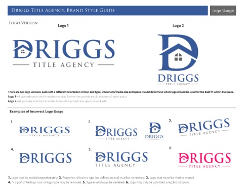
Driggs Title Agency, Brand Style Guide                                                                                              Logo Usage


       Logo Version
                                       Logo 1                                                                     Logo 2


                                                                                                       DRIGGS


      There are two logo versions, each with a different orientation of icon and type. Document/media size and space should determine which logo should be used for the best fit within the space.

      Logo 1 will generally work best in medium to large formats that provide ample amounts of open space.
      Logo 2 will generally work best in smaller formats that provide less space to work with.


       Examples of Incorrect Logo Usage


        1.                                                 2.                                                  3.


                                                                                               DRIGGS


        4.                                                 5.                                                  6.


      1. Logo must be scaled proportionately. 2. Proportion of icon to type (as defined above) must be maintained. 3. Logo must never be tilted or rotated.
      4. No part of the logo icon or logo type may be removed. 5. Type must always be centered. 6. Logo may only be colorized using brand colors.