Page 93 - Krugmans Economics for AP Text Book_Neat
P. 93
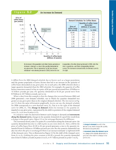
figure  5.2                 An Increase in Demand


                  Price of
                coffee beans
                (per pound)                                               Demand Schedules for Coffee Beans
                                                                                     Quantity of coffee beans          Section 2 Supply and Demand
                      $2.00                                                               demanded
                                                                           Price of    (billions of pounds)
                       1.75                  Demand curve                coffee beans
                                             in 2006                     (per pound)  in 2002    in 2006
                       1.50                                                $2.00        7.1        8.5
                                                                            1.75        7.5        9.0
                       1.25                                                 1.50        8.1        9.7
                                                                            1.25        8.9       10.7
                       1.00
                                                                            1.00       10.0       12.0
                       0.75                                                 0.75       11.5       13.8
                               Demand curve                                 0.50       14.2       17.0
                       0.50    in 2002                 D 1     D 2

                         0      7     9     11    13    15    17
                                               Quantity of coffee beans
                                                   (billions of pounds)


                          An increase in the population and other factors generate an  in population, the other showing demand in 2006, after the
                          increase in demand—a rise in the quantity demanded at  rise in population—and their corresponding demand
                          any given price. This is represented by the two demand  curves. The increase in demand shifts the demand curve to
                          schedules—one showing demand in 2002, before the rise  the right.


             It differs from the 2002 demand schedule due to factors such as a larger population
             and the greater popularity of lattes, factors that led to an increase in the quantity of
             coffee beans demanded at any given price. So at each price, the 2006 schedule shows a
             larger quantity demanded than the 2002 schedule. For example, the quantity of coffee
             beans consumers wanted to buy at a price of $1 per pound increased from 10 billion to
             12 billion pounds per year, the quantity demanded at $1.25 per pound went from
             8.9 billion to 10.7 billion pounds, and so on.
               What is clear from this example is that the changes that occurred between 2002 and
             2006 generated a  new  demand schedule, one in which the quantity demanded was
             greater at any given price than in the original demand schedule. The two curves in Fig-
             ure 5.2 show the same information graphically. As you can see, the demand schedule
             for 2006 corresponds to a new demand curve, D 2 , that is to the right of the demand
             curve for 2002, D 1 . This change in demand shows the increase in the quantity de-
             manded at any given price, represented by the shift in position of the original demand
             curve, D 1 , to its new location at D 2 .
               It’s crucial to make the distinction between such changes in demand and movements
             along the demand curve, changes in the quantity demanded of a good that result from
             a change in that good’s price. Figure 5.3 on the next page illustrates the difference.
               The movement from point A to point B is a movement along the demand curve: the
             quantity demanded rises due to a fall in price as you move down D 1 . Here, a fall in the  A change in demand is a shift of the
             price of coffee beans from $1.50 to $1 per pound generates a rise in the quantity de-  demand curve, which changes the quantity
             manded from 8.1 billion to 10 billion pounds per year. But the quantity demanded can  demanded at any given price.
             also rise when the price is unchanged if there is an increase in demand—a rightward shift  A movement along the demand curve
             of the demand curve. This is illustrated in Figure 5.3 by the shift of the demand curve  is a change in the quantity demanded of a
             from D 1 to D 2 . Holding the price constant at $1.50 a pound, the quantity demanded  good that is the result of a change in that
             rises from 8.1 billion pounds at point A on D 1 to 9.7 billion pounds at point C on D 2 .  good’s price.


                                               module  5    Supply and Demand: Introduction and Demand           51

