
Page 39 - The Principle of Economics
P. 39
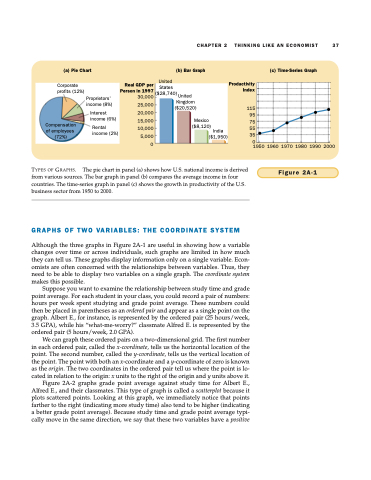
(a) Pie Chart
(b) Bar Graph
(c) Time-Series Graph
 Real GDP per Person in 1997 30,000
25,000 20,000 15,000 10,000
115
 95
 75
 55
 35
  0
United
5,000 0
Productivity Index
CHAPTER 2
THINKING LIKE AN ECONOMIST 37
    Corporate profits (12%)
Compensation of employees (72%)
Proprietors’ income (8%)
Interest income (6%)
Rental income (2%)
    1950 1960 1970 1980 1990 2000
Figure 2A-1
TYPES OF GRAPHS. The pie chart in panel (a) shows how U.S. national income is derived from various sources. The bar graph in panel (b) compares the average income in four countries. The time-series graph in panel (c) shows the growth in productivity of the U.S. business sector from 1950 to 2000.
    GRAPHS OF TWO VARIABLES: THE COORDINATE SYSTEM
Although the three graphs in Figure 2A-1 are useful in showing how a variable changes over time or across individuals, such graphs are limited in how much they can tell us. These graphs display information only on a single variable. Econ- omists are often concerned with the relationships between variables. Thus, they need to be able to display two variables on a single graph. The coordinate system makes this possible.
Suppose you want to examine the relationship between study time and grade point average. For each student in your class, you could record a pair of numbers: hours per week spent studying and grade point average. These numbers could then be placed in parentheses as an ordered pair and appear as a single point on the graph. Albert E., for instance, is represented by the ordered pair (25 hours/week, 3.5 GPA), while his “what-me-worry?” classmate Alfred E. is represented by the ordered pair (5 hours/week, 2.0 GPA).
We can graph these ordered pairs on a two-dimensional grid. The first number in each ordered pair, called the x-coordinate, tells us the horizontal location of the point. The second number, called the y-coordinate, tells us the vertical location of the point. The point with both an x-coordinate and a y-coordinate of zero is known as the origin. The two coordinates in the ordered pair tell us where the point is lo- cated in relation to the origin: x units to the right of the origin and y units above it.
Figure 2A-2 graphs grade point average against study time for Albert E., Alfred E., and their classmates. This type of graph is called a scatterplot because it plots scattered points. Looking at this graph, we immediately notice that points farther to the right (indicating more study time) also tend to be higher (indicating a better grade point average). Because study time and grade point average typi- cally move in the same direction, we say that these two variables have a positive
States ($28,740) United
Kingdom ($20,520)
Mexico
($8,120)
India
($1,950)
