
Page 64 - Canadian House & Home - xxx 2010
P. 64
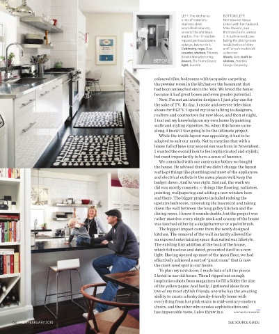
LEFT: The kitchen is BOTTOM LEFT:
a mix of materials: Homeowner Tanya
stainless steel, Linton with her husband,
enamelled cabinets, Mike Sheerin, and
ceramic tile and black their son Eddie, almost
marble. The 10' marble- 2. A built-in bookcase
topped peninsula was a facing the dining room
splurge, but worth it. holds bottles of wine
Cabinetry, rugs, Ikea; and Tanya’s cookbook
counter, shelves, Thomas collection.
Brooks Manufacturing; Stools, Ikea; built-in
BEFORE faucet, The Home Depot; shelves, Franklin
light, Eurolite. Design Carpentry.
coloured tiles, bedrooms with turquoise carpeting,
the powder room in the kitchen or the basement that
had been untouched since the ’60s. We loved the house
because it had great bones and even greater potential.
Now, I’m not an interior designer: I just play one for
the sake of TV. By day, I create and oversee television
shows for HGTV. I spend my time talking to designers,
realtors and contractors for new ideas, and then at night,
I test out my knowledge on my own home by painting
walls and styling vignettes. So, when this house came
along, I knew it was going to be the ultimate project.
While the inside layout was appealing, it had to be
adapted to suit our needs. Not to mention that with a
house full of boys (our second son was born in November),
I wanted the overall look to feel sophisticated and stylish,
but most importantly to have a sense of humour.
We consulted with our contractor before we bought
the house. He advised that if we didn’t change the layout
and kept things like plumbing and most of the appliances
and electrical outlets in the same places we’d keep the
budget down. And he was right. Instead, the work we
did was mostly cosmetic — things like flooring, radiators,
painting, wallpapering and adding a new window here
and there. The bigger projects included redoing the
upstairs bathroom, renovating the basement and taking
down the wall between the long galley kitchen and the
dining room. I know it sounds doable, but the project was
rather massive: every single nook and cranny of the house
was touched either by a sledgehammer or a paintbrush.
The biggest impact came from the newly designed
kitchen. The removal of the wall instantly allowed for
an exposed entertaining space that suited our lifestyle.
The existing tiny addition at the back of the house,
which felt useless and dated, presented itself in a new
light. Having opened up most of the main floor, we had
effectively achieved a sort of “great room” that is now
the most-used spot in our house.
To plan my new decor, I made lists of all the pieces
I loved in our old house. Then I ripped out enough
inspiration shots from magazines to fill a folder the size
of the yellow pages. And lastly, I gathered ideas from
two of my most stylish friends: one who has the amazing
ability to create a funky family-friendly home with
everything from hot pink stairs to mid-century-modern
chairs, and the other who exudes sophistication and
has impeccable taste. I also threw in a CONTINUED ON PAGE 90
62 H&H FEBRUARY 2010 SEE SOURCE GUIDE
12/3/09 4:36:38 PM
FEB - Tanya Linton.indd 3 12/3/09 4:36:38 PM
FEB - Tanya Linton.indd 3