
Page 30 - High Knob Master Plan
P. 30
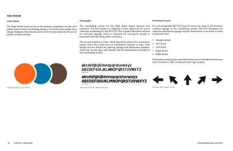
SIGN DESIGN
Color Palette
The High Knob brand serves as the primary inspiration for the color palette used in these wayfinding designs. As communities adopt these design strategies, their brand colors can be incorporated into the accent panels as demonstrated.
Typography
The wayfinding system for the High Knob region features two typefaces. The first typeface is Highway Gothic, approved for use in vehicular wayfinding by the MUTCD. This typeface should be utilized for vehicular signage, which is intended for viewing by people in motorized vehicles along public roadways.
The second typeface is Trim, which should be utilized for community names when they don’t have an established typeface or logo. Trim should also be utilized for parking signage and destination markers, which are on-site signs that identify specific destinations included in the wayfinding system.
abcdefghijklmnopqrstuvwxyz ABCDEFGHIJKLMNOPQRSTUVWXYZ
Highway Gothic
abcdefghijklmnopqrstuvwxyz ABCDEFGHIJKLMNOPQRSTUVWXYZ
Trim SemiBold
Approved Fonts for Wayfinding Signs
Directional Arrows
It is recommended MUTCD-Type D arrows be used in all motorist- oriented signage in the wayfinding system. MUTCD Standards for vehicular directional signage require destinations to be listed in order of direction first:
> Straight ahead > Left (veer)
> Left (turn)
> Right (veer)
> Right (turn)
Destinations sharing the same directional arrows should be listed from
top to bottom in order of distance from sign location.
      Wayfinding Base Color Palette
Vehicular Directional Arrows
30 CHAPTER 5: WAYFINDING
HIGH KNOB REGIONAL INITIATIVE
