
Page 34 - The Black Range Naturalist Vol. 4, No. 3
P. 34
Black Range Surface and Groundwater
The drought continues, and the possibility that it is a megadrought (lasting two decades or more) is increasingly heard.
As individuals, there is woefully little that we can do; in aggregate there is much we can do, and when our society decides to address the issue, the prospects become reasonably manageable. But from the individual, to the aggregate, to society as a whole is a long march. We can begin the march, one that is in everyone’s long-term interest, by learning all we can about the current situation. Despite all of the hype, we know surprisingly little.
In this article we assess the danger (very briefly - much has been written elsewhere), discuss some of the things we know and those that we do not, how we go about knowing, and our financial- political response to the situation.
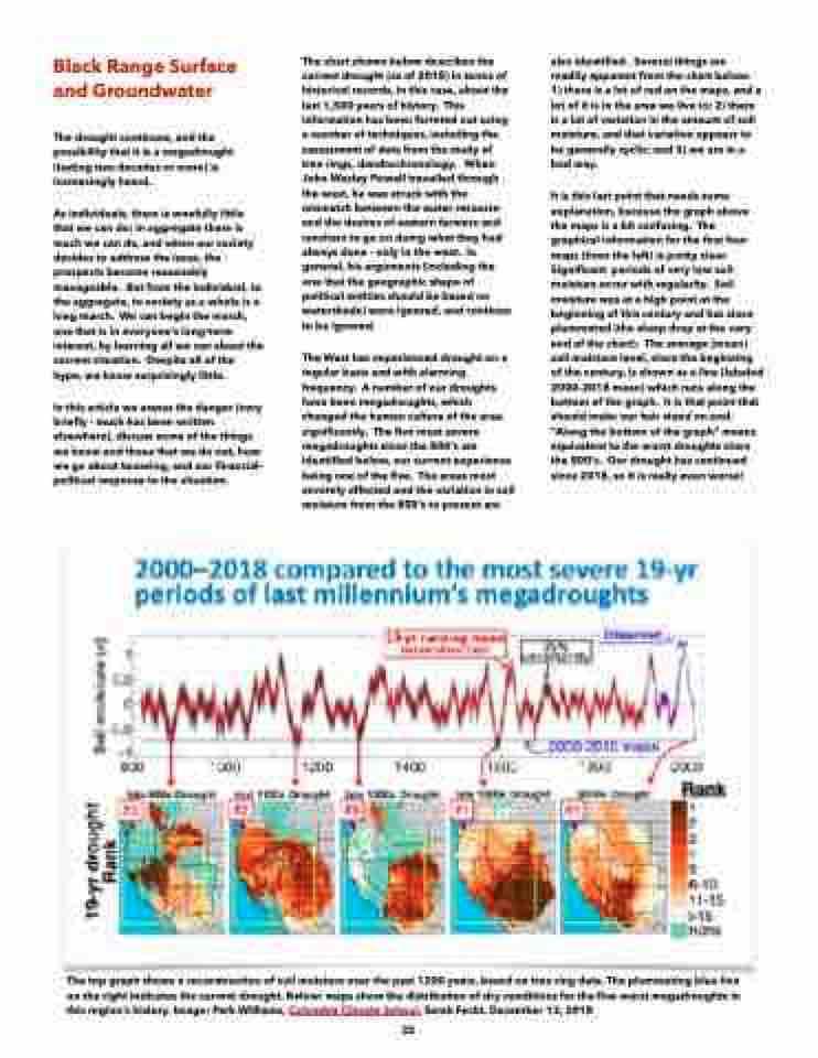
The chart shown below describes the current drought (as of 2018) in terms of historical records, in this case, about the last 1,500 years of history. This information has been ferreted out using a number of techniques, including the assessment of data from the study of tree rings, dendrochronology. When John Wesley Powell travelled through the west, he was struck with the mismatch between the water resource and the desires of eastern farmers and ranchers to go on doing what they had always done - only in the west. In general, his arguments (including the one that the geographic shape of political entities should be based on watersheds) were ignored, and continue to be ignored.
The West has experienced drought on a regular basis and with alarming frequency. A number of our droughts have been megadroughts, which changed the human culture of the area significantly. The five most severe megadroughts since the 800’s are identified below, our current experience being one of the five. The areas most severely affected and the variation in soil moisture from the 800’s to present are
also identified. Several things are readily apparent from the chart below: 1) there is a lot of red on the maps, and a lot of it is in the area we live in; 2) there is a lot of variation in the amount of soil moisture, and that variation appears to be generally cyclic; and 3) we are in a bad way.
It is this last point that needs some explanation, because the graph above the maps is a bit confusing. The graphical information for the first four maps (from the left) is pretty clear. Significant periods of very low soil moisture occur with regularity. Soil moisture was at a high point at the beginning of this century and has since plummeted (the sharp drop at the very end of the chart). The average (mean) soil moisture level, since the beginning of the century, is shown as a line (labeled 2000-2018 mean) which runs along the bottom of the graph. It is that point that should make our hair stand on end. “Along the bottom of the graph” means equivalent to the worst droughts since the 800’s. Our drought has continued since 2018, so it is really even worse!
The top graph shows a reconstruction of soil moisture over the past 1200 years, based on tree ring data. The plummeting blue line on the right indicates the current drought. Below: maps show the distribution of dry conditions for the five worst megadroughts in this region’s history. Image: Park Williams, Columbia Climate School, Sarah Fecht, December 13, 2018
33
