
Page 72 - The Decorative Painter Winter 2017
P. 72
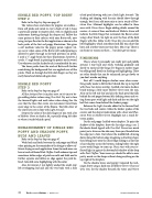
SINGLE RED POPPY, TOP RIGHT STEP 2
Refer to the Step-by-Steps on page 67.
The various hues and colors for poppies are endless – from soft pinks and corals to every shade of red. I chose a particular poppy to inspire color, with its slightly pink undertones showing through the deeper red. Follow the same pattern to float color as with your Buttermilk, now using Antique Rose for the first application as shown in the back petals of the first red poppy illustration. This gives a soft medium value for the poppy petals. Lighter val- ues occur when some of the Buttermilk underpainting is allowed to glow through in forward portions on petals. I used a 3⁄8" angle brush for these illustrations; however, I used a 1⁄2" angle brush in painting the project on the wood. Use whatever size flat shader brush is comfortable for you.
The lower petals show the wash of Buttermilk further neutralizing the background that was applied over all the petals. Wash on through the little dark fingers as they are easily found and darkened again later.
SINGLE RED POPPY STEP 3
Refer to the Step-by-Steps on page 67
All the Antique Rose is in place now, so it’s time to be- gin adding darker values using True Red. Try not to lose the forward lights and mid-values when doing this. Be sure that the lines that create eye movement travel from outer edge to the center of the bloom. The little sliver of the center you see is done with Light Avocado.
Deepen the color of the dark fingers of mix with a bit of Midnite Green to shade a bit, especially along left sides or where it tucks behind a petal.
ENHANCEMENT OF SINGLE RED
POPPY AND SHADOW POPPY,
BUDS AND LEAVES
Refer to the Step-by-Steps on page 67.
Work back and forth between the red poppy and black value painting on the remainder of the design to allow suf- ficient drying on each application. Some forward areas can have a touch of floated Pink Chiffon. It will enhance tips and sometimes define edges of petals on rolls and folds and to further separate and define an edge against the petal be- hind. I also did some highlighting with this color.
Also, for interest, I just lightly washed the small, top/ left overlapping leaf and also the two buds with a hint
of red petal showing with just a little Light Avocado. The shading and shaping with the mix should show through enough, but if not, add more mix or just a touch of Plan- tation Pine. Minimal highlights can be added to these areas with Citron Green. Begin adding details around the centers. A series of lines and daubs of Midnite Green will indicate the little fringe that surrounds the flower center using a liner brush. Go right on over the base of the dark fingers with this. Allow to dry. Once dry, you can add the little highlights, which sometimes look like tiny, short fine lines and at other times just tiny dots. Mix it up. There is no rhyme or reason on them ... but don’t get too many.
FINISHING
This is where I personally can really putt and puddle around. I step back and study, working gradually and slowly to repeat all the things I’ve begun in earlier stages by adding small details in shading and highlighting. There are other details that can be enhanced; just go slowly so you don’t overdo anything.
First off, I would deepen shadow areas where some- thing really needs to fall further behind, like up in top/left with those two leaves overlap. I added a lot more shadow, brush-mixing a little more Midnite Green into the mix. Also on the left side leaf and also the back petal that falls behind the red poppy bottom/left, defining stems and set- ting them apart with light and dark and also on the right leaf that comes from behind the shadow poppy.
Enhance the Light Avocado added to the forward leaf, the two buds and centers. Make the darker spokes of the centers and the deeper indentation with a liner and Plan- tation Pine or Midnite Green. Highlight just a touch be- tween spokes.
On the red poppy I added water droplets. To paint the shadow of the droplets, draw the far edge using a no. 2 flat shader brush tipped with True Red. Do not use much paint, just a sliver on the side away from you, blended into the edge just a hint. Start about the middle/left, drawing down along the bottom edge imagining a dewdrop shape, then lifting more onto the chisel edge ending in a fine line of cast shadow across the bottom, ending before the right curve would begin to come up. Next, start with your re- flected light in against the bottom/left shadow of the drop with Pink Chiffon. Your inner eye should be able to now pretty much see the drops without doing anything on the top right of the droplets.
On the shadow leaves and poppy I repeated the tech- nique above using a dark mix of Midnite Green+Charcoal Grey (2:1) for the shadow beneath the water and Warm
70 The Decorative Painter • WINTER 2017
DECORATIVEPAINTERS.ORG
