
Page 130 - The Decorative Painter Spring 2014
P. 130
Certification Corner
Intensity and the Certification Critique Form
SUE PRUETT mda
The intensity of a specific color is relative to another color of equal, more, or less intensity.
The Certification Critique form is divided into sections, each focusing on a specific part of the judging process. Each section has specific questions that focus on the
most important properties of color, blending, neatness, background, stroke control, varnish, and the frame. This is the third in a four-part series on the Certification Critique. The goal of breaking down this process is to help the applicant understand how to interpret the questions on the form. The judge’s job is to answer these questions as they relate to the applicant’s painting. Here we will explore the section on intensity.
Intensity (also referred to as chroma) is one of the three dimensions of color. The other two dimensions are: hue, which relates to the actual color of an object; and value, which describes the light or dark qualities of
a color. Intensity describes how weak (dull) or strong
Red
Question: ___ is too bright in relation to other areas.
When one color stands out more than another, quite possibly it is because that particular color is more intense (brighter) than the others; therefore, it is too bright in relation to other areas. When the eye travels around a painting it is more pleasing to have the colors flow— meaning similar intensities. If one color is brighter than the others, the eye will jump to that one color throughout the painting.
Question: ___ is too dull in relation to other areas.
If a color is too dull in relation to the other colors it may get lost on the background; therefore, it needs to be brighter to show up. Stand back from the painting to make sure all colors show up from a distance.
Question: More intensity needed to create flow and interest.
When the eye travels around a painting it is more pleasing to have the colors flow with similar intensities. If one color is too dull in relation to the other colors, that color will look weak (or lacking) in relation to the other intensities.
Question: The intensity of the ___ causes the eye to jump from ___ to ___.
When one color stands out among the rest it probably means that color is either lighter/darker (value) than the others, or brighter and more intense than the others. When this happens, the eye will jump from one intense color to another.
Question: Intensity of the background is supportive/too bright/too dull.
The background is the largest area of the painting surface. For this reason the intensity should be toned so it rests in the background and does not overpower the entire painting. If the background is too intense it will compete with the objects and overpower the painting.
(bright) a color appears—low intensity is weak and high intensity is strong.
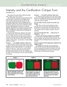
EXAMPLE 1
Shown is the complementary color scheme of red and green on a white background. Both red and green have similar intensities and are seen equally on a white background.
EXAMPLE 2
EXAMPLE 3
Green Red+tch Green
Red and green have similar intensities on the green background. One way to control this is to lower the intensity of the red by toning it with a tiny amount of the green, hence creating a similar intensity.
Green Red
128 The Decorative Painter • ISSUE NO. 1, 2014
decorativepainters.org
Green
Red
When the complementary color scheme of red and green is applied on a green background the red will show first, mainly because red is green’s complement, but also because it now appears more intense than the green.
