
Page 97 - The Decorative Painter Spring 2018
P. 97
Certification Corner
Leaves
DEBORAH BONNEWELL cda
It doesn’t matter what subjects you enjoy painting or which medium you use, leaves may be incorporated into these designs. They often support the other elements in artwork but often go unnoticed.
When I first started painting I thought of them as bor- ing with little character. I now have developed a deeper appreciation for leaves. Take a closer look with me and see how many interesting traits they have.
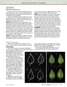
COLOR: Although many leaves are indeed green, each design requests its leaves to play a different role. Realistic leaves identify a particular plant or flower by their color and shape. They tell the viewer what time of year it is and happenings in their environment. It is not a surprise to see very unrealistic leaves used to depict a fun, playful design in colors relating to that design. Pink, purple or turquoise leaves may be the exact compliment to a particular work of art. In the end, color doesn’t really matter as long as it is used in harmony with the design.
SHAPE: The structure of all leaves is relatively consistent. They have a middle often accompanied by a center vein. The addition of smaller veins may be present but not
Painting Technique
There are as many technical ways to paint leaves as there are varieties. However, most methods are consistent.
FOR EXAMPLE...
The center vein starts at the stem placed slightly off center, and appears slightly curved. It continues toward the tip getting progressively smaller, disap-
pearing before it reaches the point.
This technique will prevent the leaf
from being cut exactly in half, which is
distracting to the viewer’s eye.
To give a leaf its shape, the high- light is usually placed within an area and shaped similar to that area. I pre- fer to paint an oval on the larger side of the leaf, which gradually blends into its neighboring value. Multiple highlights should be slightly different from each other in shape and inten- sity to avoid the polka-dot effect.
Shading is generally placed where the stem connects, traveling on the outer edge. The center vein is shaded behind the curved line, gradually tapering off.
Applying accents of color reflect the other colors used in the design. For example, a pink rose leaf will have
necessary. The various outer edges give definition to their shape. The stem attaches the leaf to its life source.
FORM: Most leaves appear to be flat like a piece of paper but in fact they can lift, curl, bend, roll, etc. To depict
this type of movement the form of the leaf needs to be developed using a variation of values. The actual form of a leaf is a cylinder shape. To lift or roll an area the light is placed where the leaf rises. The dark value is placed where the leaf is in shadow and/or where it connects to the stem area. To learn more about the cylinder shape use a paper towel cut in the shape of a leaf, and then lift and roll areas to see how the raised areas will catch the light. PLACEMENT: The placement of leaves in a design will determine their demand for attention. Ask yourself how important the leaves are and treat them accordingly with appropriate colors and attention to detail. Leaves near the focal area should have more values and detail. Leaves in the background should have fewer details and values to show that these are receding. Similar values to the back- ground will also help the leaves to appear further away.
a touch of pink resting on its leaf. Apply color to an edge and blend into the leaf until it disappears; this is an excel- lent way to carry color around the design.
Even though completing the blossom may be more exciting, the leaf beneath can frame it and give it life.
DECORATIVEPAINTERS.ORG
The Decorative Painter
• ISSUE NO. 2, 2016 95
