
Page 70 - The Decorative Painter - Fall 2019
P. 70
Painter’s Checklist
SURFACE
Stonehenge paper in Kraft color. Paper comes in sheets so cut to size: 11" x 14"
(27.94 x 35.56 cm) to fit in a mat with an
8" x 10" (20.32 x 25.40 cm) opening.
PALETTE
PRISMACOLOR PREMIER WAX PENCILS
French Grey 10% 1068 French Grey 20% 1069 Ginger Root 1084 Marine Green 988 Mineral Orange 1033 Pumpkin Orange 1032 Sandbar Brown 1094 Sepia 948
Terra Cotta 944
White 938
Yellowed Orange 1002
PRISMACOLOR VERITHIN COLORED PENCILS Verithin Dark Brown Verithin Terra Cotta
SUPPLIES
Basic painting supplies (page 96)
Backing board, at least one inch larger than
paper. Must be smooth, no ridges. I use mat
board or a sketch board.
Black Factis Eraser (try not to erase but if you
do, use this lightly)
Soft clean brush
White transfer paper
Frixion Erasable Pen (red works best) – or may
use a stylus
Fresh masking tape or Frog tape. Tape the
absolute smallest corner if you tape. Hand-held sharpener
Scharff Moon Scrubber (size #6)
LETʼS PAINT
Notes: Please read before painting. VALUE – INTENSITY
– TEMPERATURE.
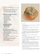
Light source is upper right, slightly to the side (opposite the cast shadow).
Feel free to play with the colors and go with what comes out of the pencil. There are some guidelines, however.
The orange pencils used on the right side of the squash are slightly lighter and warmer (value and temperature). They are Mineral Orange, highlighted with Yellowed Orange and/or Ginger Root.
In the middle is a layered mix of Mineral Orange and Pumpkin Orange.
On the left side Pumpkin Orange is shaded with Terra Cotta (and then Sepia if needed to darken further.)
Try to avoid straight lines. Add green splotches over orange and orange over green. Be sure to keep shapes and sizes random and not similar.
Highlight 1: To highlight the orange, let the paper color work for you. Holding the pencil further back toward the end, use a lighter touch allowing paper to show through. If it doesn’t work, don’t worry, just layer lighter color on top.
Also notice that some of the sections on the top part are blended into each other rather than strictly separate. This is to break up the uniformity.
The “white” stripes are not white. On the warm side (the right) they are Ginger Root, highlighted with French Grey 10%
68 TheDecorativePainter • FALL 2019
